Color Dynamics: The Emotional Impact of Color Transitions
The Psychology of Color: A Brief Overview
Color is not just a visual experience; it evokes emotions and influences our behavior. For instance, warm colors like red and orange can create feelings of excitement or urgency, while cooler shades like blue and green often promote calmness and tranquility. This psychological effect of color is widely utilized in marketing and design to elicit specific responses from audiences.
Color is the keyboard, the eyes are the harmonies, the soul is the piano with many strings.
Imagine walking into a room painted in bright yellow; you might feel energetic and happy. Conversely, a dimly lit space adorned in deep blue could make you feel more introspective or serene. Understanding these emotional triggers allows us to use color effectively in various contexts, from our homes to branding strategies.
The concept of color psychology emphasizes that our responses to colors are not just personal but can also be culturally influenced. Different cultures may attach diverse meanings to the same color, highlighting the complex relationship between color, emotion, and context.
Color Transitions: The Power of Flow
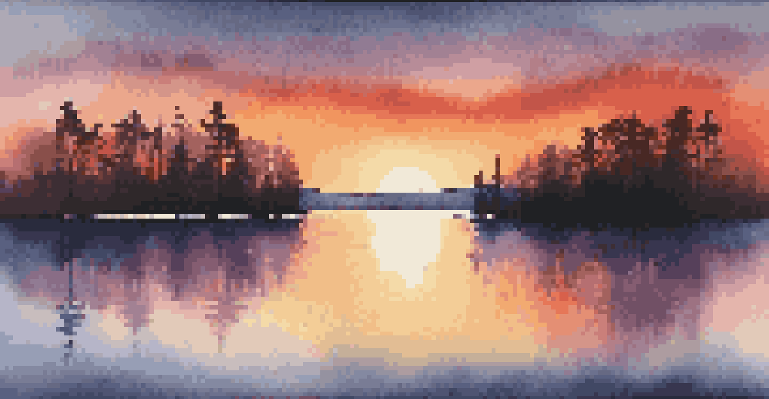
Color transitions refer to the gradual change of one color to another, creating a sense of movement or progression. This dynamic can significantly impact our emotional responses, as smooth transitions may evoke feelings of harmony, while abrupt shifts can create tension or surprise. Think of a sunset, where the colors shift seamlessly from warm hues to cool tones, often evoking a sense of peace and reflection.
In design, utilizing color transitions can guide the viewer's eye and enhance the storytelling of visual content. For example, a website that transitions from bright, inviting colors to softer tones can create a journey that mirrors the user’s emotional state, making the experience more immersive.
Color Influences Emotions
Colors evoke specific emotions and behaviors, impacting various environments from homes to marketing strategies.
By understanding how color transitions work, designers and marketers can craft experiences that resonate deeply with their audience, prompting desired emotional reactions and enhancing overall engagement.
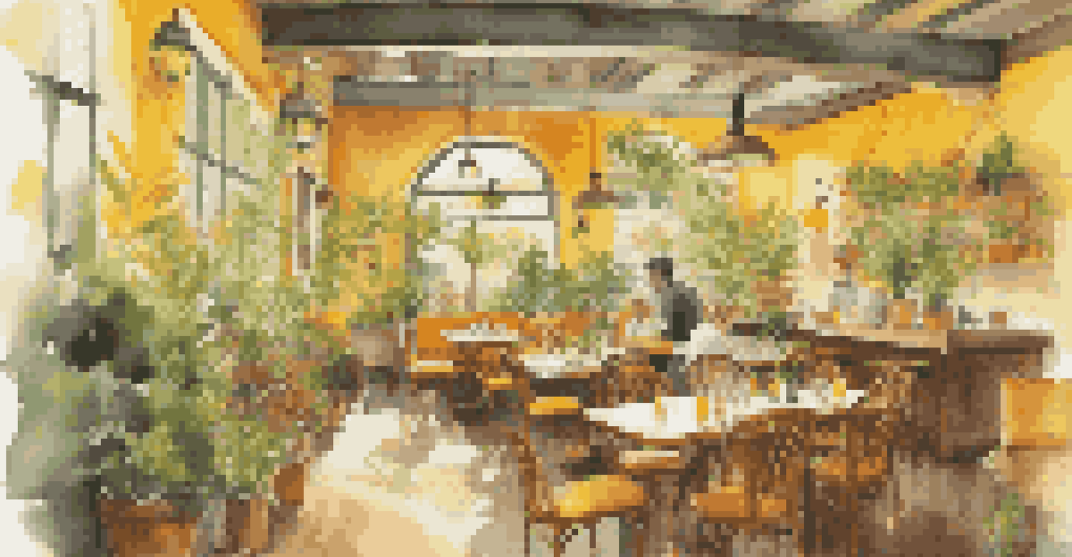
Warm Colors: Energizing and Inviting Feelings
Warm colors, such as reds, yellows, and oranges, are often associated with energy, enthusiasm, and warmth. They can stimulate feelings of happiness and excitement, making them popular choices in environments meant to foster social interactions, like restaurants or cafes. For instance, a red wall can make a dining space feel cozy and inviting, encouraging guests to linger longer.
Colors, like features, follow the changes of the emotions.
However, it’s essential to use warm colors judiciously; too much can lead to feelings of agitation or anxiety. In a workspace, splashes of orange or yellow can enhance creativity, but if overused, they might create a chaotic atmosphere. Finding the right balance is key.
Ultimately, incorporating warm colors into your environment can uplift moods and inspire action, but being mindful of their intensity is crucial to maintaining a harmonious space.
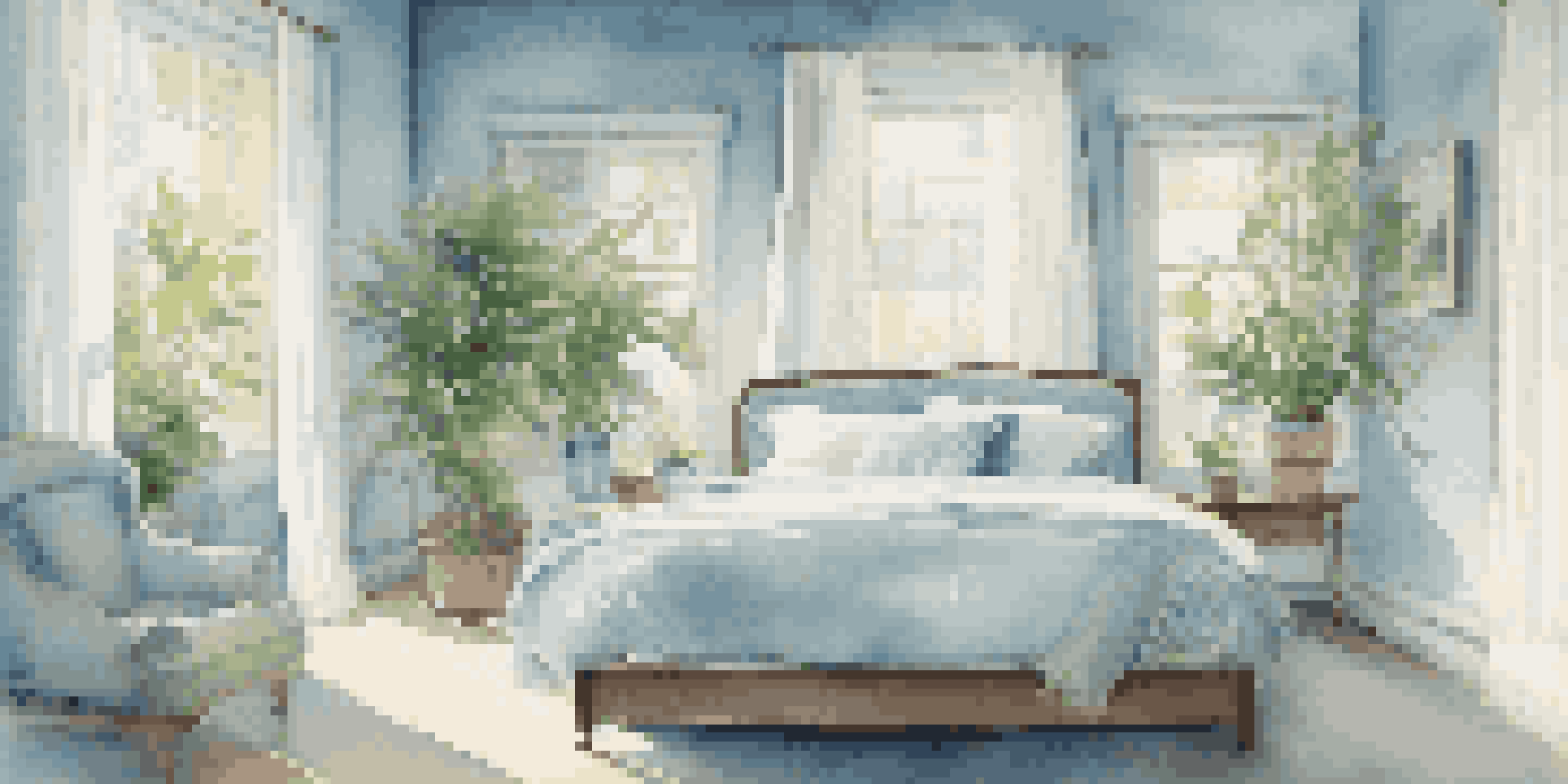
Cool Colors: Calming and Restorative Effects
Cool colors, including blues, greens, and purples, typically evoke feelings of calmness, tranquility, and balance. These shades are often used in spaces designed for relaxation, such as bedrooms or meditation areas, to encourage a peaceful atmosphere. Imagine a serene blue sky; it naturally brings about a sense of calm and clarity.
In professional settings, cool colors can help reduce stress and create a focused environment, making them ideal for offices and study areas. A soft green can promote concentration while maintaining a sense of balance, allowing for productivity without feeling overwhelmed.
Cultural Significance of Colors
Colors carry different meanings across cultures, making it essential for businesses to understand these nuances in a global market.
Using cool colors strategically can enhance your environment's emotional resonance, fostering a serene space where individuals can recharge and reflect.
The Role of Color in Branding and Marketing
Color is a powerful tool in branding and marketing, helping companies convey their identity and evoke emotional responses from consumers. Different colors can symbolize various attributes; for example, blue often represents trust and reliability, making it a popular choice for financial institutions. When consumers associate a color with a brand, they often develop an emotional connection that can influence purchasing decisions.
Moreover, color can differentiate a brand in a crowded marketplace. Think of how instantly recognizable red is for Coca-Cola or the calming green of Starbucks. These color choices are not mere aesthetics; they are strategic decisions that tap into the emotional psyche of consumers.
By understanding the emotional impact of colors, businesses can create more effective marketing strategies that resonate with their target audience, ultimately driving engagement and loyalty.
Cultural Perspectives on Color and Emotion
Colors carry different meanings across cultures, which can significantly influence emotional responses. For instance, while white is often associated with purity and new beginnings in Western cultures, it can symbolize mourning in some Eastern cultures. This cultural context is crucial for businesses operating in a global market, as misinterpretations can lead to unintended emotional impacts.
When designing marketing campaigns or products for diverse audiences, understanding these cultural nuances helps avoid miscommunication and ensures a positive reception. For example, a campaign that uses vibrant reds may evoke excitement in one culture but could be perceived as aggressive in another.
Harnessing Color for Well-Being
Intentional color choices in personal spaces can enhance emotional well-being and create harmonious living environments.
Cultural insights into color can enhance emotional connections and foster inclusivity, allowing brands to resonate meaningfully with a diverse audience.
Harnessing Color Dynamics for Personal Spaces
Understanding color dynamics can transform your personal spaces into environments that enhance your emotional well-being. By selecting colors that align with your desired mood—be it energizing warm tones for a workout room or calming cool shades for a bedroom—you can create spaces that support your lifestyle effectively. Consider using color swatches or mood boards to experiment with combinations that feel right for you.
Additionally, incorporating color transitions in your decor can add depth and interest. For instance, a gradient of blues transitioning to greens can evoke a sense of serenity while visually expanding a space. This thoughtful approach can lead to a more harmonious living environment.
Ultimately, being intentional about color choices not only beautifies your space but also nurtures your emotional health, making your home a true sanctuary.