Color Mixing Techniques: From Theory to Practical Application
Understanding the Color Wheel: Your Mixing Guide
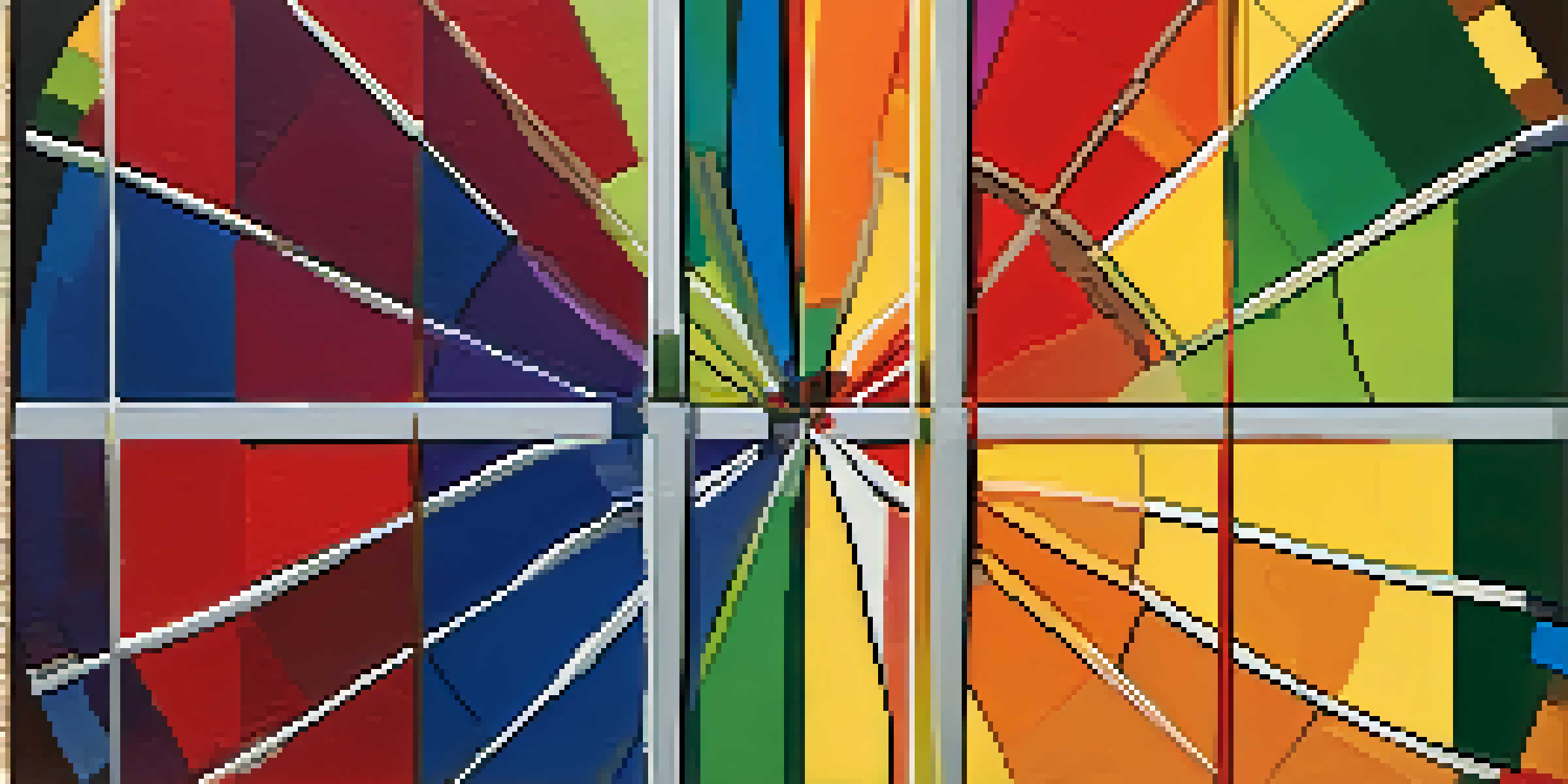
The color wheel is a foundational tool for artists, helping visualize relationships between colors. It consists of primary, secondary, and tertiary colors, arranged in a circular format. By understanding this wheel, you can easily see how colors mix and interact with one another.
Color is the keyboard, the eyes are the harmonies, the soul is the piano with many strings.
Primary colors—red, blue, and yellow—cannot be made by mixing other colors, while secondary colors, like green, orange, and purple, result from mixing two primary colors. Tertiary colors arise from mixing a primary color with a secondary color, offering even more variety.
This simple structure not only aids in creating harmonious color palettes but also serves as a springboard for more complex mixing techniques, making it an essential starting point for any artist or designer.
Additive vs. Subtractive Color Mixing Explained
Color mixing can be categorized into two main types: additive and subtractive. Additive mixing occurs when light colors combine, as seen in digital screens, where red, green, and blue (RGB) create white light. This approach is essential for anyone working with digital art or design.
On the flip side, subtractive mixing happens when pigments combine. This is the principle behind painting, where cyan, magenta, and yellow (CMY) combine to create black. Understanding these differences is crucial for artists, as it influences the choice of materials and techniques.
Color Wheel Basics for Artists
The color wheel helps artists understand the relationships between primary, secondary, and tertiary colors, aiding in the creation of harmonious palettes.
Knowing when to use each method can significantly affect the outcome of your work, whether you're designing graphics or creating a masterpiece on canvas.
Mastering Primary Colors: The Building Blocks
Primary colors are the essence of color mixing; they form the foundation of all other colors. By mastering how to mix these colors effectively, you can create an endless array of hues. Experimenting with different ratios of primary colors will help you develop your unique palette.
Color is the visual perception of light, and the light we see is a reflection of the colors in the environment around us.
For example, mixing equal parts of red and blue yields purple, but adjusting the ratio can create shades like violet or lavender. This hands-on approach encourages exploration and fosters creativity in your work.
With a solid grasp of primary colors, you'll find it easier to blend secondary and tertiary colors, unlocking even more possibilities for your artistic endeavors.
Exploring Secondary Colors: Mixing for Depth
Once you're comfortable with primary colors, it’s time to dive into the world of secondary colors. These vibrant hues add depth and richness to your artwork, enhancing visual interest. Mixing equal parts of two primary colors creates these secondary colors, making them crucial for any artist's toolkit.
Consider the emotional impact of colors: green evokes calmness, orange brings warmth, and purple inspires creativity. Understanding the emotional resonance of these colors can help you convey specific moods and messages in your work.
Additive vs. Subtractive Mixing
Recognizing the difference between additive mixing (light) and subtractive mixing (pigments) is essential for making informed choices in digital and traditional art.
By incorporating secondary colors into your palette, you can create more dynamic compositions that captivate your audience and elevate your artistic expression.
Using Tertiary Colors for Unique Shades
Tertiary colors offer an exciting opportunity to create unique shades by blending primary and secondary colors. This mixing technique allows artists to achieve nuanced tones that can make artwork more engaging. For instance, mixing blue with green results in teal, a beautiful color that adds complexity to your palette.
These colors can also help you refine your color schemes, enabling you to achieve a cohesive look in your work. Experimenting with different combinations encourages creativity and can lead to unexpected and delightful results.
Incorporating tertiary colors not only expands your palette but also enhances your ability to communicate visually, making your artwork stand out.
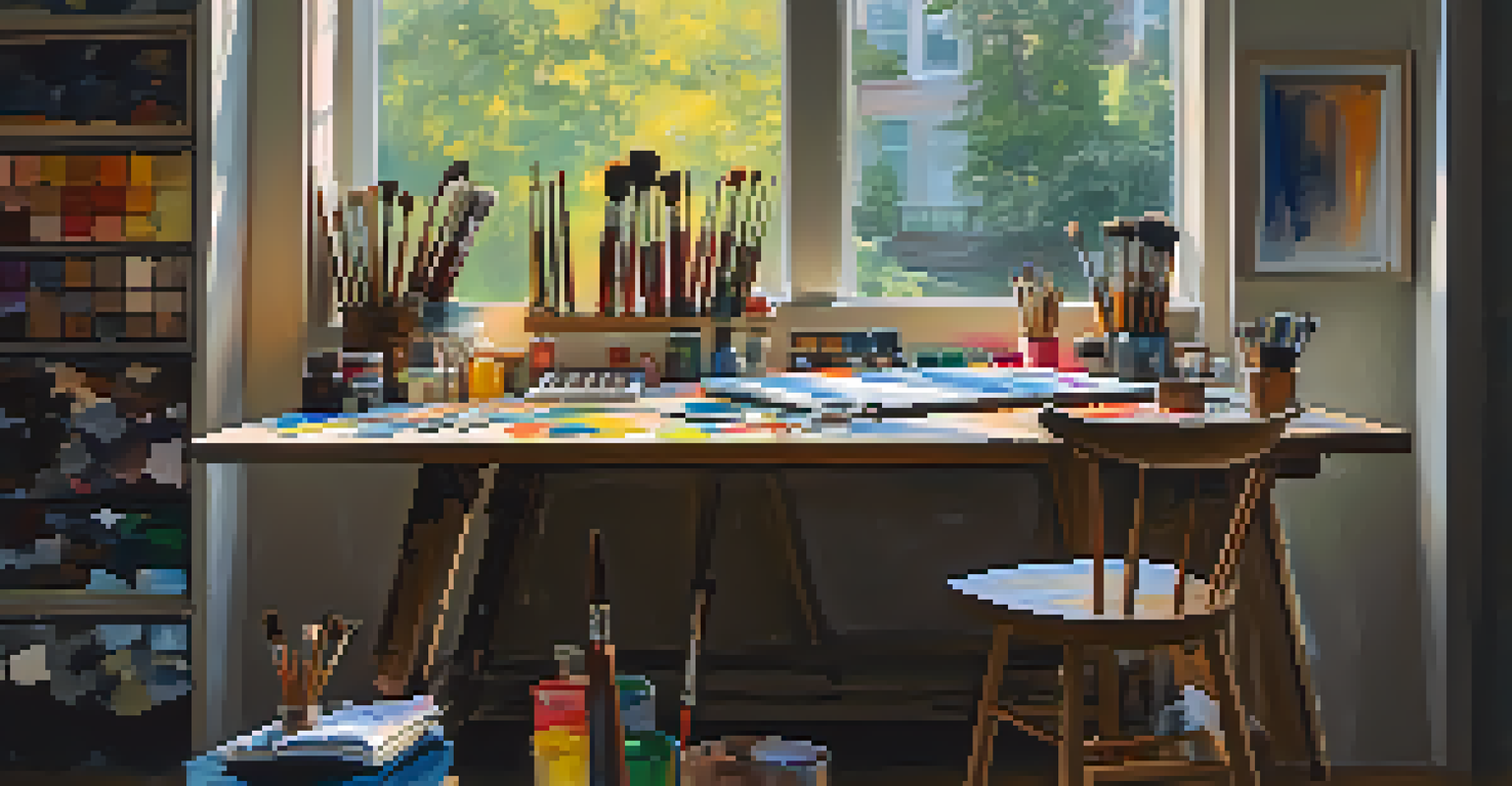
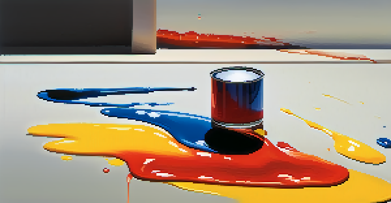
Practical Color Mixing Techniques: Experiment and Play
The best way to master color mixing is through hands-on experimentation. Set aside time to play with your paints or digital tools, mixing colors freely without the pressure of creating a finished piece. This playful approach fosters creativity and builds confidence in your mixing skills.
Consider using a color journal to document your experiments. This not only helps you track your progress but also serves as a reference for future projects. You can note down the ratios used and the results achieved, creating a personalized mixing guide.
Experimenting Enhances Creativity
Hands-on experimentation with color mixing not only builds confidence but also fosters unique artistic styles and personal palettes.
Remember, the journey of color mixing is as important as the destination. Each mix teaches you something new, helping you grow as an artist and refine your unique style.
The Role of Color Theory in Art and Design
Understanding color theory is crucial for artists and designers alike, as it informs your mixing decisions and enhances your overall work. Color theory encompasses the relationships between colors, the emotional impact they have, and how they can be combined effectively. By grasping these principles, you can create visually striking compositions.
For example, complementary colors—those opposite each other on the color wheel—create high contrast and vibrant effects when used together. On the other hand, analogous colors—those next to each other—produce a harmonious and soothing effect. Knowing when to use these relationships can significantly elevate your work.
Ultimately, color theory is a valuable tool that can guide your artistic choices, helping you craft pieces that resonate with your audience.