Color Psychology: How Colors Affect Our Emotions and Mood
What is Color Psychology and Why It Matters
Color psychology is the study of how different colors affect our emotions and behaviors. It plays a crucial role in various fields, from marketing to interior design, influencing our decisions and perceptions. By understanding color psychology, we can harness the power of colors to create desired feelings in ourselves and others.
Colors, like features, follow the changes of the emotions.
For instance, think about how you feel when you see bright yellow. It often evokes feelings of happiness and optimism. Conversely, darker colors like black can invoke feelings of sadness or seriousness. This emotional response to color is universal and can be leveraged in everyday life.
Whether you're decorating a room or choosing an outfit, being aware of how colors affect mood can enhance your experience. This understanding allows you to create environments that promote positivity or calmness, tailored to what you or others may need at that moment.
The Warm Colors: Energy and Passion
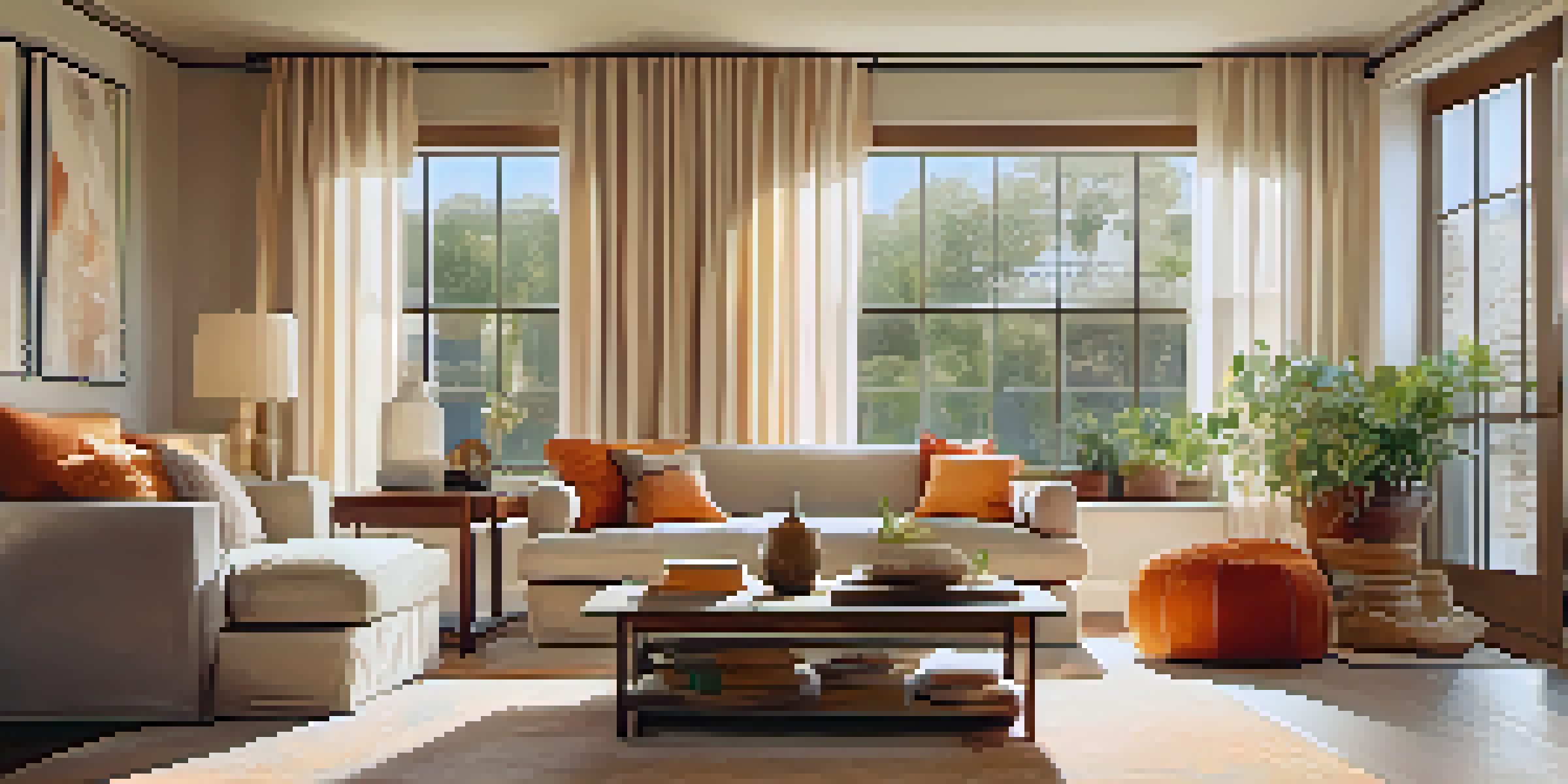
Warm colors like red, orange, and yellow are often associated with energy and passion. They can stimulate feelings of excitement and warmth, making them perfect for social spaces. For example, a restaurant might use red accents to encourage appetite and conversation among diners.
However, too much red can lead to feelings of aggression or anxiety. It's about finding the right balance; incorporating warm colors in moderation can create a lively atmosphere without overwhelming the senses. Imagine a cozy living room with warm orange cushions that invite you to relax and engage.
Color Influences Emotions and Behaviors
Color psychology reveals how different colors can significantly impact our feelings and actions in various aspects of life.
Using warm colors strategically can elevate moods and foster connections, making them ideal for gatherings or creative spaces. The key is to combine them thoughtfully with other colors to enhance their effects while maintaining harmony.
Cool Colors: Calmness and Tranquility
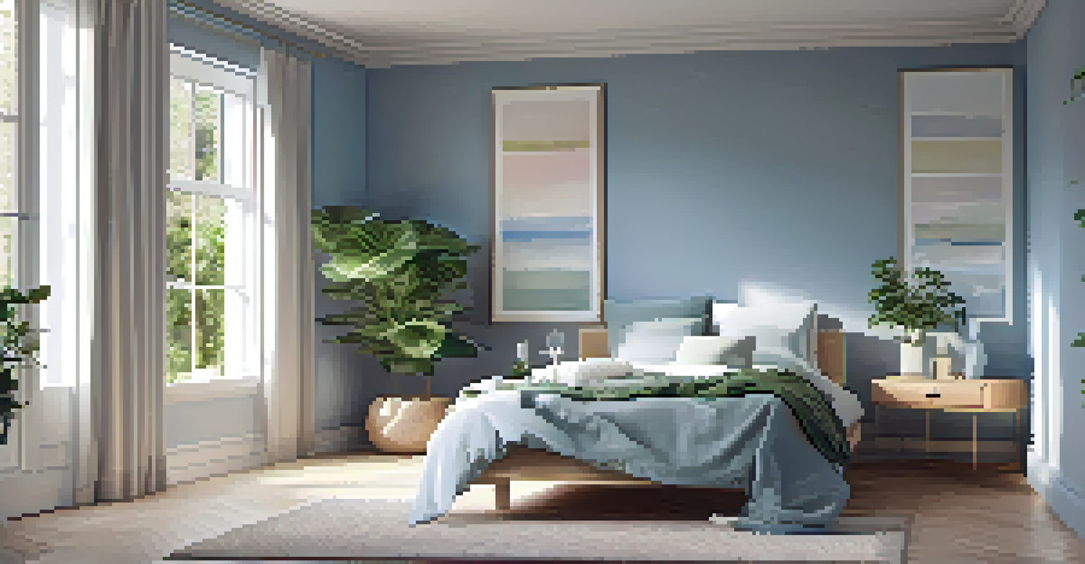
On the other end of the spectrum, cool colors like blue, green, and purple are known for their calming effects. These colors often evoke a sense of peace and relaxation, making them suitable for bedrooms or meditation spaces. Picture a serene blue room that instantly calms your racing thoughts after a hectic day.
The only thing that can change the world is the color of your heart.
Moreover, studies have shown that blue can lower heart rates and reduce feelings of anxiety. This is why many spas and wellness centers incorporate cool tones into their designs. They create an environment where you can unwind and recharge.
Incorporating cool colors into your surroundings can promote a tranquil atmosphere, helping you to focus and destress. A simple touch of green in your workspace, for instance, can boost creativity while providing a refreshing break from the hustle.
The Psychological Effects of Neutral Colors
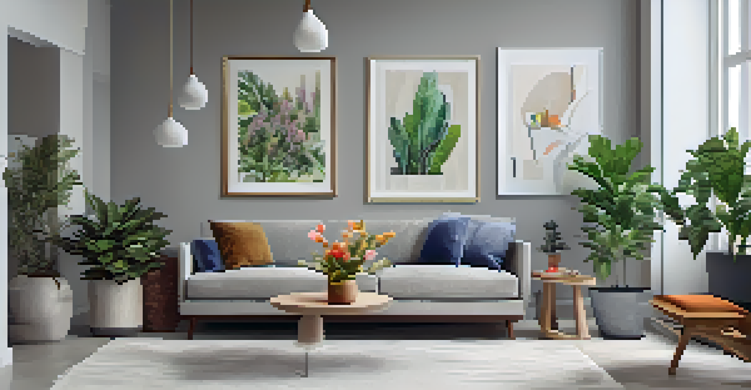
Neutral colors—such as white, gray, and beige—play a pivotal role in color psychology. They offer a sense of balance and can create a calming backdrop for more vibrant colors. Think of a gallery wall; neutral shades allow the artwork to shine without distraction.
However, relying too heavily on neutrals can lead to feelings of dullness or lack of inspiration. It’s essential to combine neutral tones with pops of color to maintain engagement and interest. For example, a beige room with bright green plants can create a refreshing and inviting space.
Warm and Cool Colors Create Moods
Warm colors evoke energy and passion, while cool colors promote calmness and tranquility, affecting the atmosphere of spaces.
Using neutral colors thoughtfully can enhance your environment, providing a canvas that supports other colors and influences mood effectively. They can also make spaces feel larger and more open, promoting a sense of tranquility.
Cultural Differences in Color Perception
It's fascinating how color perception can vary significantly across cultures. For instance, while white is often associated with purity and weddings in Western cultures, it can symbolize mourning in some Eastern cultures. This cultural context is crucial to consider when using color in international branding or design.
Understanding these differences can help avoid miscommunication and ensure that the intended message is conveyed. When designing for a global audience, it’s wise to research how colors are perceived in different regions. This knowledge can help create more inclusive and relatable experiences.
Being culturally aware of color meanings can enhance your interactions and designs, ensuring they resonate positively with diverse audiences. It’s a reminder that color is not just a visual element; it carries significant emotional and cultural weight.
The Impact of Color on Marketing and Branding
In marketing, color plays a crucial role in brand identity and consumer behavior. Brands often choose specific colors to evoke particular emotions and establish connections with their audience. For instance, fast-food chains frequently use red and yellow to stimulate hunger and attract attention.
The right color can make a brand memorable and influence purchasing decisions. Think about how you feel when you see the iconic blue of Facebook or the green of Starbucks; these colors are carefully chosen to reflect the brand’s values and evoke desired feelings in consumers.
Cultural Context Shapes Color Perception
Understanding how color meanings differ across cultures is essential for effective communication in design and marketing.
Understanding the psychology behind color can give businesses a competitive edge. By aligning their color choices with their brand message, companies can create a stronger emotional bond with their audience, leading to increased loyalty and engagement.
Using Color to Enhance Personal Well-Being
Individuals can also harness the power of color to boost their mood and well-being. For instance, wearing bright colors on a gloomy day can lift your spirits, while soft pastels might promote calmness. It's all about finding what resonates with you personally.
Creating a space that reflects your emotional needs can significantly improve your overall well-being. You might choose calming blues for your bedroom or energizing yellows for a home office. Each color selection can shape your daily experience and emotional state.
By intentionally incorporating colors that uplift or soothe you, you can create an environment that nurtures your mental health. It's a simple yet effective way to enhance your mood and cultivate a more positive atmosphere in your life.