Color Wheel Fundamentals: Understanding Color Relationships
What is a Color Wheel and Why Does It Matter?
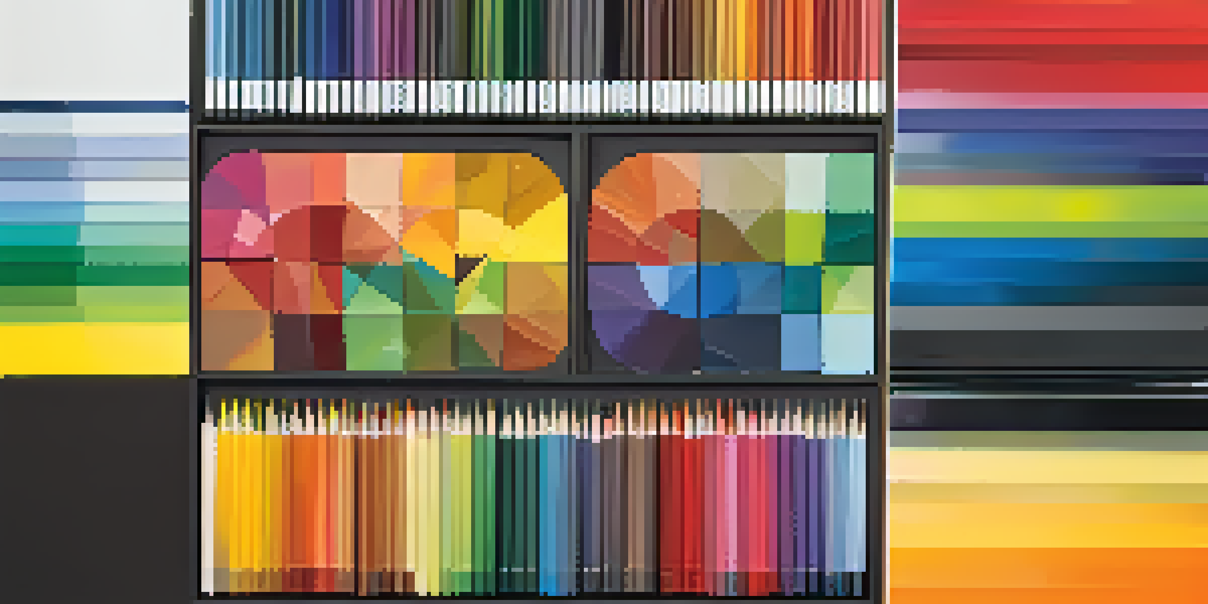
A color wheel is a circular diagram that displays hues around a circle, helping us understand color relationships. It serves as a foundational tool in art, design, and even marketing, guiding decisions on color combinations. By visualizing how colors relate to one another, artists and designers can create more harmonious and impactful works.
Color is the keyboard, the eyes are the harmonies, the soul is the piano with many strings.
Imagine a color wheel as a map for your creative journey. Just as a map helps you navigate new territories, the color wheel helps you explore the vast world of color. Whether you're a painter, graphic designer, or just someone looking to freshen up your living space, understanding this tool can make all the difference.
In essence, the color wheel is not just a pretty picture; it's a powerful guide. By grasping its principles, you can elevate your projects, ensuring that your color choices resonate with your intended audience and evoke the desired emotions.
Primary Colors: The Building Blocks of the Wheel
At the core of the color wheel are the primary colors: red, blue, and yellow. These colors cannot be created by mixing others but serve as the foundation for all other hues. Think of them as the basic ingredients in a recipe; without them, you can't create a variety of dishes—or in this case, colors.

When combined, primary colors produce secondary colors: green, orange, and purple. For example, mixing blue and yellow yields green, showcasing how these fundamental hues work together. This interplay is crucial in understanding how to build your color palette effectively.
Understanding Color Relationships
The color wheel serves as a guide to help artists and designers create harmonious and impactful color combinations.
Recognizing the significance of primary colors allows you to experiment more freely. Just as a chef masters the basics before creating culinary masterpieces, understanding primary colors empowers you to mix and match hues with confidence.
Secondary Colors: The Magic of Mixing Primaries
Secondary colors emerge from mixing two primary colors, adding depth to the color wheel. For instance, red and blue combine to create purple, while blue and yellow produce green. This blending process is akin to mixing different flavors to create a unique dish—it's all about experimentation.
Colors, like features, follow the changes of the emotions.
Understanding secondary colors enriches your color palette. They provide additional options for creating contrast and balance in your designs. Just like in cooking, where a pinch of salt can elevate a dish, the right secondary color can enhance your overall composition.
By leveraging secondary colors, you can convey different moods and emotions in your work. Whether aiming for a vibrant and energetic vibe or a calm and soothing atmosphere, these hues play a crucial role in your creative expression.
Tertiary Colors: The Blend of Primary and Secondary
Tertiary colors are created by mixing a primary color with a neighboring secondary color. This results in hues like red-orange or blue-green, which add even more variety to your color wheel. Think of them as the unique spices that can transform a standard recipe into something extraordinary.
These colors allow for subtlety and nuance in your designs, helping you achieve a more sophisticated look. Tertiary colors bridge the gap between the boldness of primary colors and the richness of secondary colors, providing a spectrum of options.
The Role of Primary and Secondary Colors
Primary colors are the foundational elements of the color wheel, while secondary colors emerge from mixing them, adding depth to your palette.
Incorporating tertiary colors into your palette can lead to more dynamic and visually interesting compositions. Just as a skilled chef balances flavors to create a harmonious dish, a designer uses these colors to create a cohesive and engaging visual experience.
Complementary Colors: The Power of Contrast
Complementary colors are pairs of colors that sit directly opposite each other on the color wheel, such as red and green or blue and orange. These combinations create a striking visual contrast that can draw attention and create a sense of vibrancy. Imagine wearing a bright outfit against a neutral background—it's all about making a statement.
Using complementary colors effectively can enhance your design by creating focal points. When placed side by side, these colors intensify each other, making the overall composition pop. This technique is often used in branding to evoke strong emotional responses.
However, it's essential to use complementary colors judiciously. Too much contrast can overwhelm viewers, so finding a balance is key. Just like a well-prepared dish needs the right amount of seasoning, your color choices should harmonize rather than clash.
Analogous Colors: Harmony in Color Schemes
Analogous colors sit next to each other on the color wheel, such as blue, blue-green, and green. These colors share similar hues, creating a harmonious and cohesive look. Think of them as flavors that naturally complement each other, like peanut butter and jelly.
Using an analogous color scheme can evoke a sense of calm and unity in your designs. This approach is often favored in nature scenes or serene environments, as it mimics the subtle transitions found in the natural world. It's a great way to create a soothing atmosphere.
Harnessing Color Psychology
Colors evoke emotions, and leveraging color psychology can enhance audience connection and communication in your projects.
By incorporating analogous colors, you can achieve a more monochromatic look while still adding depth. Just as a painter uses varying shades to bring a landscape to life, you can use these similar hues to create visual interest without overwhelming your audience.
Color Psychology: The Emotional Impact of Colors
Colors evoke emotions and can influence perceptions, a concept known as color psychology. For instance, red often symbolizes passion and energy, while blue is associated with calmness and trust. Understanding these associations can help you make informed color choices in your projects.
By leveraging color psychology, you can enhance the emotional response of your audience. Whether designing a website, a brand logo, or an interior space, selecting colors that align with your message can create a stronger connection. It's like choosing the right background music for a movie—everything works together to set the mood.

Incorporating knowledge of color psychology into your compositions allows you to communicate more effectively. Just as a storyteller carefully chooses words to convey emotions, your color choices can tell a powerful story that resonates with viewers on a deeper level.
Applying Color Wheel Knowledge to Your Projects
Now that you understand the basics of the color wheel, it's time to apply this knowledge to your projects. Whether you're an artist, designer, or simply someone looking to refresh your space, the principles of color relationships can guide your choices. Start by referencing the color wheel to help you create balanced and visually appealing combinations.
Experimenting with different color schemes can lead to exciting discoveries. Don't be afraid to mix and match primary, secondary, and tertiary colors to find what resonates with you. Just like a chef might try new combinations in the kitchen, your creativity can flourish when you're open to exploration.
Ultimately, the goal is to create compositions that not only look good but also evoke the right emotions and connections with your audience. By harnessing the power of the color wheel, you'll elevate your projects and ensure your message is conveyed effectively.