The Emotional Effects of Warm Colors in Visual Art
Understanding Warm Colors and Their Significance
Warm colors, including reds, oranges, and yellows, are often associated with feelings of warmth and comfort. These colors can evoke a sense of energy and enthusiasm, making them powerful tools for artists. The emotional response to these colors is often instinctive, tied to our experiences and cultural associations.
Color is the keyboard, the eyes are the harmonies, the soul is the piano with many strings.
For instance, a vibrant red can symbolize passion or love, while a soft yellow may evoke happiness and optimism. This psychological connection is rooted in both nature and our daily lives, where warm colors are prevalent in sunsets, flowers, and even certain foods. By understanding these associations, artists can use warm colors to shape viewer emotions intentionally.
Additionally, warm colors can create a sense of intimacy and closeness. In visual art, they often draw the viewer's eye and create a focal point, enhancing the emotional narrative of the piece. This effect can be particularly powerful in portraits or scenes depicting human interaction, where warmth fosters connection.
The Psychological Effects of Warm Colors
Psychologically, warm colors can stimulate feelings of excitement and vibrancy. When people encounter these hues, it can lead to an increase in heart rate and feelings of urgency. This is why many fast-food restaurants use red and yellow in their branding—to encourage quick decisions and create a lively atmosphere.
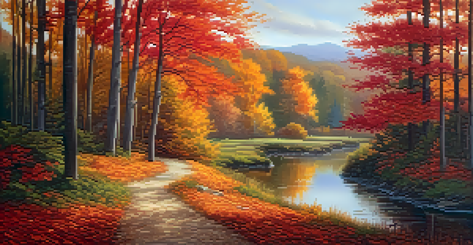
Moreover, warm colors can also invoke nostalgia and memory. For example, a painting featuring warm autumn tones might remind someone of cozy family gatherings during the fall season. This emotional layering makes warm colors particularly effective in storytelling through art.
Warm Colors Evoke Strong Emotions
Warm colors like reds and yellows can elicit feelings of passion, happiness, and intimacy, significantly shaping viewer experiences in art.
However, it's essential to note that the effects of warm colors can vary based on context and individual perception. What feels energizing to one person might feel overwhelming to another. Thus, artists must consider their audience and the story they want to tell when selecting their color palette.
Cultural Interpretations of Warm Colors
Across different cultures, warm colors can have varying meanings and emotional impacts. In some cultures, red symbolizes luck and prosperity, while in others, it may signify danger or aggression. This diversity in interpretation is crucial for artists to understand, especially when creating works intended for diverse audiences.
Colors are the smiles of nature.
For example, in many Eastern cultures, red is a color of celebration, commonly seen during festivals and weddings. In contrast, in Western contexts, it might be linked to strong emotions such as anger or love. By being aware of these cultural nuances, artists can enhance the emotional resonance of their work.
Incorporating these cultural interpretations can also expand the emotional depth of an artwork. An artist who weaves in the significance of warm colors from various cultures can create a richer narrative, inviting viewers to explore and connect on multiple levels.
Warm Colors in Different Art Forms
Warm colors are not limited to traditional painting; they are prevalent in various art forms, including photography, sculpture, and digital art. Each medium can manipulate warm colors in unique ways, shaping the emotional experience differently. For instance, in photography, warm filters can soften the mood of an image, creating a nostalgic or romantic feel.
In sculpture, the use of warm-toned materials, such as terracotta or wood, can convey a sense of warmth and earthiness. This tactile quality enhances the emotional connection between the viewer and the artwork. Artists often choose these materials purposefully to elicit specific feelings.
Cultural Context Shapes Color Meaning
The interpretation of warm colors varies across cultures, influencing how artists communicate emotions and narratives in their work.
Digital artists also leverage warm colors to create immersive experiences. By using techniques like color gradients and lighting effects, they can transport viewers into vibrant worlds that evoke specific emotions. This versatility shows the power of warm colors in engaging audiences across various artistic expressions.
The Role of Warm Colors in Interior Design
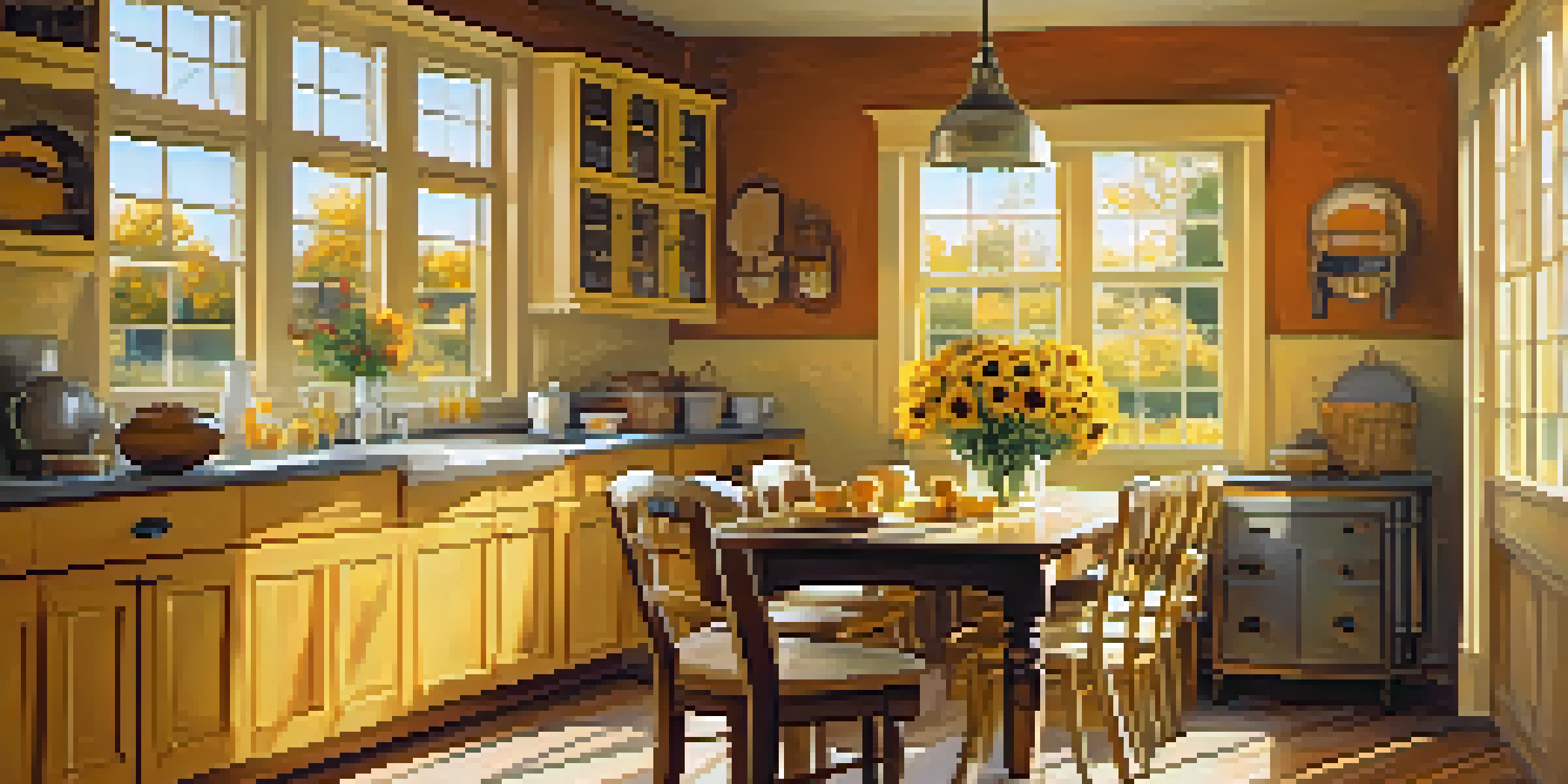
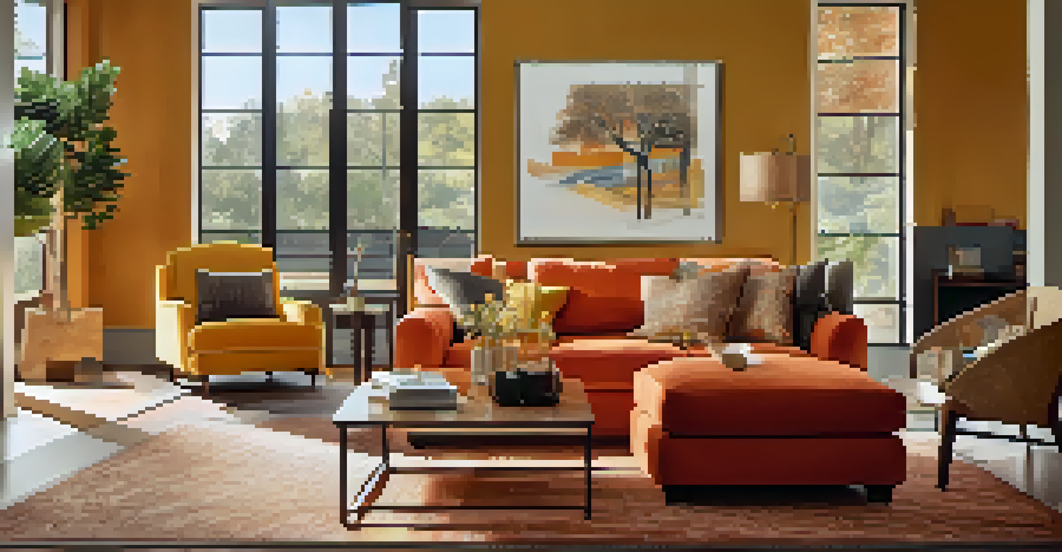
Warm colors play a significant role in interior design, affecting how we feel in a space. Designers often use these colors to create inviting environments, encouraging relaxation and comfort. For example, warm yellows and oranges can make a kitchen feel cozy and welcoming, perfect for family gatherings.
Additionally, the choice of warm colors can enhance the functionality of spaces. In areas meant for social interaction, like living rooms, warm tones encourage conversation and connection. This emotional effect is why many restaurants and cafes use warm colors to create an inviting atmosphere that draws people in.
However, balance is key when using warm colors in interior design. Too much warmth can lead to feelings of restlessness or discomfort. By integrating cooler tones alongside warm ones, designers can create a harmonious space that maintains emotional balance.
Creating Emotional Impact Through Color Harmony
Artists often use color harmony to create a cohesive emotional impact in their work. By combining warm colors with complementary shades, they can evoke a wide range of feelings and set the tone for their narratives. For instance, pairing warm reds with cool blues can create tension, while warm yellows with soft greens can promote tranquility.
This interplay of colors can guide the viewer's emotional journey through the artwork. An artist may choose to emphasize certain emotions by strategically placing warm colors in key areas, drawing attention and invoking specific feelings. This technique allows for a dynamic storytelling experience.
Warm Colors Enhance Interior Spaces
In interior design, warm colors create inviting environments that encourage social interaction and emotional comfort.
Furthermore, understanding color theory can enhance this emotional storytelling. Artists who grasp how colors interact can create more profound connections with their audience, allowing for a richer interpretation of their work. This knowledge empowers artists to craft visual experiences that resonate deeply.
The Future of Warm Colors in Art and Design
As trends in art and design evolve, the use of warm colors continues to adapt. Contemporary artists are exploring new ways to express emotions through color, often blending traditional techniques with modern concepts. This evolution allows for fresh interpretations of warm colors and their emotional effects.
Moreover, advancements in technology are enabling artists to explore warm colors in innovative ways. Virtual reality and augmented reality provide immersive experiences that can amplify the emotional impact of warm colors. These tools allow artists to experiment with color in ways that were previously unimaginable.
Looking ahead, the emotional effects of warm colors will likely remain a vital aspect of art and design. As artists and designers continue to push boundaries, the interplay of color and emotion will keep evolving, inviting audiences to engage with their work in new and meaningful ways.