The Impact of Color Temperature on Emotional Interpretation

Understanding Color Temperature: What Is It?
Color temperature refers to the hue of a light source, measured in Kelvin (K). It describes how 'warm' or 'cool' a light appears, influencing our surroundings. For instance, a candle emits a warm glow around 2000K, while daylight can be around 5000K to 6500K, giving it a cooler, bluish tone.
Color is the keyboard, the eyes are the harmonies, the soul is the piano with many strings.
Knowing the difference between warm and cool light is crucial because it can set the mood in various environments. Warm light tends to create a cozy, inviting atmosphere, while cool light can feel more sterile and energizing. This distinction plays a vital role in everything from home decor to photography.
As we delve deeper into color temperature, it’s essential to recognize that our emotional responses are often tied to these visual cues. Just like a favorite painting can evoke memories, the lighting in a room can stir feelings of comfort or alertness.
Warm Colors and Their Emotional Connections
Warm colors, such as reds, oranges, and yellows, are often associated with feelings of warmth and happiness. They can evoke emotions ranging from passion and excitement to comfort and coziness. Imagine the inviting ambiance of a sunset or a crackling fireplace; these warm hues naturally draw people in.
In interior design, warm color temperatures can create intimate spaces, making them perfect for bedrooms and living rooms. Restaurants often use warm lighting to encourage diners to linger longer, enhancing their dining experience. This emotional connection can significantly impact customer satisfaction and business success.
Color Temperature Affects Mood
The hue of light influences our emotions, with warm light creating cozy atmospheres and cool light promoting alertness.
However, it's important to balance warm colors to avoid overwhelming a space. Too much warmth can lead to feelings of anxiety or irritability. Thus, understanding the emotional palette of warm colors can help create inviting environments that resonate positively with people.
Cool Colors and Their Impact on Emotions
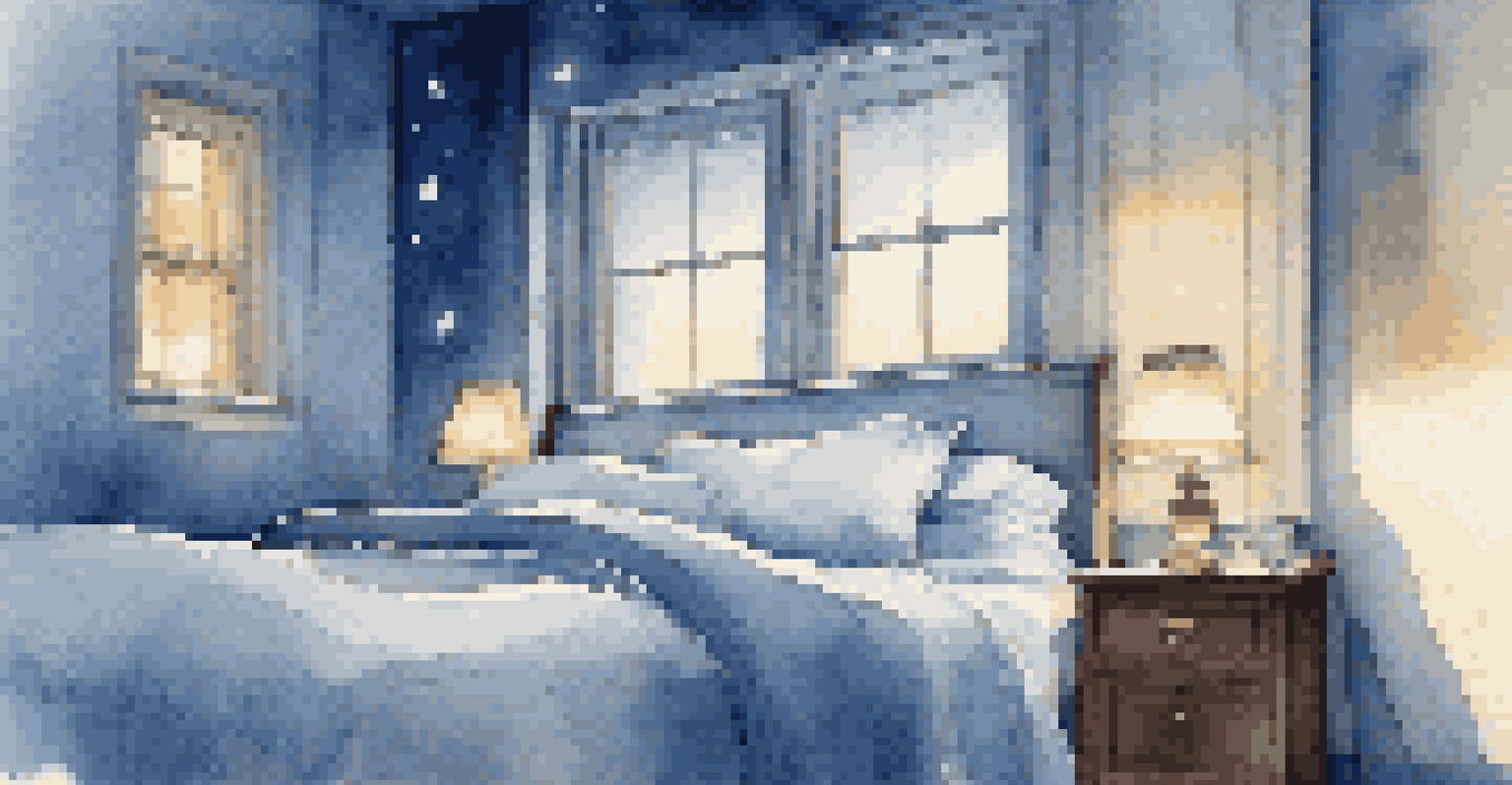
Cool colors, such as blues, greens, and purples, tend to evoke feelings of calmness and serenity. They are often associated with nature and tranquility, like the peacefulness of a forest or the soothing waves of the ocean. This emotional connection can be particularly powerful in places meant for relaxation, such as spas or bedrooms.
Colors are the smiles of nature.
In a work environment, cool lighting can enhance focus and productivity. It stimulates alertness and concentration, making it suitable for offices or study areas. Cool colors can also help reduce stress, creating a more harmonious atmosphere for both work and leisure.
However, just like warm colors, too much cool light can lead to feelings of detachment or sadness. Striking a balance between warm and cool tones can ensure a space remains inviting while promoting focus and calmness.
The Psychological Effects of Color Temperature
Research indicates that color temperature can significantly influence our psychological state. For instance, studies have shown that people exposed to warmer light tend to report feeling more relaxed and social. On the contrary, environments with cooler lighting often encourage alertness but can lead to feelings of isolation if overused.
This psychological impact extends beyond just our homes; it plays a crucial role in marketing and branding as well. Companies often choose specific lighting to evoke desired feelings in customers, impacting their purchasing decisions. The right color temperature can enhance the overall experience in retail spaces, making it an essential element of design.
Warm and Cool Colors in Design
In interior design, warm colors foster intimacy while cool colors enhance focus, making them essential for creating the desired ambiance.
By understanding these psychological effects, we can make informed choices about the environments we create or inhabit. Whether it's adjusting the lighting in our homes or considering the ambiance of a public space, color temperature matters.
Color Temperature in Art and Design
Artists and designers have long understood the emotional impact of color temperature in their work. The choice of lighting can dramatically alter the perception of a piece, influencing how viewers feel about it. For example, a painting illuminated with warm light might evoke feelings of nostalgia, while cool lighting can give it a more modern, detached feel.
In photography, color temperature is crucial in setting the mood of an image. Photographers often manipulate the light temperature to convey specific emotions, whether it’s the warmth of a golden hour sunset or the cool blues of twilight. This technique is essential for storytelling through visuals.
Understanding how color temperature interacts with artistic elements allows creators to evoke emotional responses consciously. By thoughtfully selecting lighting, they can guide the viewer’s experience and interpretation of their work.
Color Temperature in Marketing and Branding Strategies
In marketing, color temperature isn't just a design choice; it's a strategic tool. Brands often select color temperatures that align with their identity and the emotions they wish to evoke. For instance, a luxury brand might use warmer tones to create a sense of intimacy and exclusivity, while a tech company might opt for cooler tones to convey innovation and efficiency.
Retail environments, too, leverage color temperature to enhance the shopping experience. Warm lighting can encourage customers to feel relaxed and welcome, promoting longer visits and potentially increasing sales. Conversely, cooler lighting can create a sense of urgency, ideal for fast-paced shopping environments.
Strategic Use in Marketing
Brands leverage color temperature to evoke specific emotions, enhancing customer experiences and fostering brand loyalty.
Understanding the psychological implications of color temperature helps brands connect with their audience on a deeper emotional level. This emotional resonance can lead to stronger brand loyalty and a more memorable customer experience.
Practical Applications of Color Temperature in Daily Life
Knowing how color temperature impacts emotions can enhance our daily lives. For example, adjusting the lighting in your home can improve your mood and productivity. Warmer lights in the evening can signal relaxation, while cooler lights during the day can help you stay alert and focused.
In workspaces, it's beneficial to create zones with different color temperatures. A cozy warm area for brainstorming sessions can inspire creativity, while a cooler section can help with tasks requiring concentration. This thoughtful design can significantly boost overall productivity and satisfaction.

Moreover, being mindful of color temperature when choosing light bulbs for different spaces can make a noticeable difference. It’s a simple yet effective way to create environments that cater to our emotional needs and improve our daily experiences.