The Relationship Between Color and Mood in Art Therapy
Understanding Color Psychology in Art Therapy
Color psychology is the study of how colors influence feelings and behaviors. In art therapy, this concept is essential as it helps therapists understand how different hues can evoke specific emotions. For instance, warm colors like red and orange may stimulate feelings of warmth and excitement, while cool colors such as blue and green can promote calmness and serenity.
Color is the keyboard, the eyes are the harmonies, the soul is the piano with many strings.
Therapists often encourage clients to use colors that resonate with their current emotional state. This allows for a more profound exploration of feelings, as individuals may unconsciously select shades that reflect their inner turmoil or joy. Understanding the emotional weight of colors can create a safe space for clients to express themselves.
By recognizing the psychological impact colors have, therapists can guide clients in choosing the right palette for their art. This not only aids in emotional expression but also fosters a deeper connection between the client and their artwork, leading to insights and personal growth.
The Emotional Impact of Warm Colors
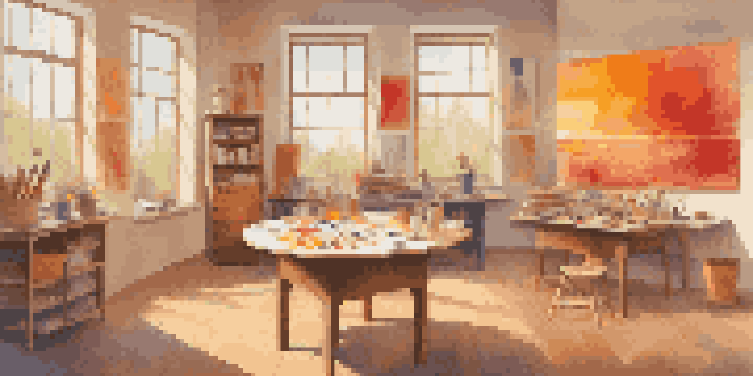
Warm colors, including reds, oranges, and yellows, are often associated with energy and passion. In art therapy, these colors can invoke feelings of excitement, enthusiasm, and even anger. When clients use warm colors in their artwork, they may be tapping into strong emotions, making it an excellent opportunity for exploration.
For example, a client who chooses red might be expressing anger or frustration, while someone who opts for yellow may be channeling happiness or optimism. This differentiation allows therapists to discuss these emotions openly during sessions. By addressing the feelings tied to these colors, clients can gain better insights into their emotional landscapes.
Colors Influence Emotions in Therapy
Understanding color psychology helps therapists guide clients in expressing their emotions through art.
Moreover, incorporating warm colors can help clients feel more energized and engaged in the creative process. This engagement is vital in art therapy, as it often leads to breakthroughs in understanding and resolving emotional issues.
The Calming Influence of Cool Colors
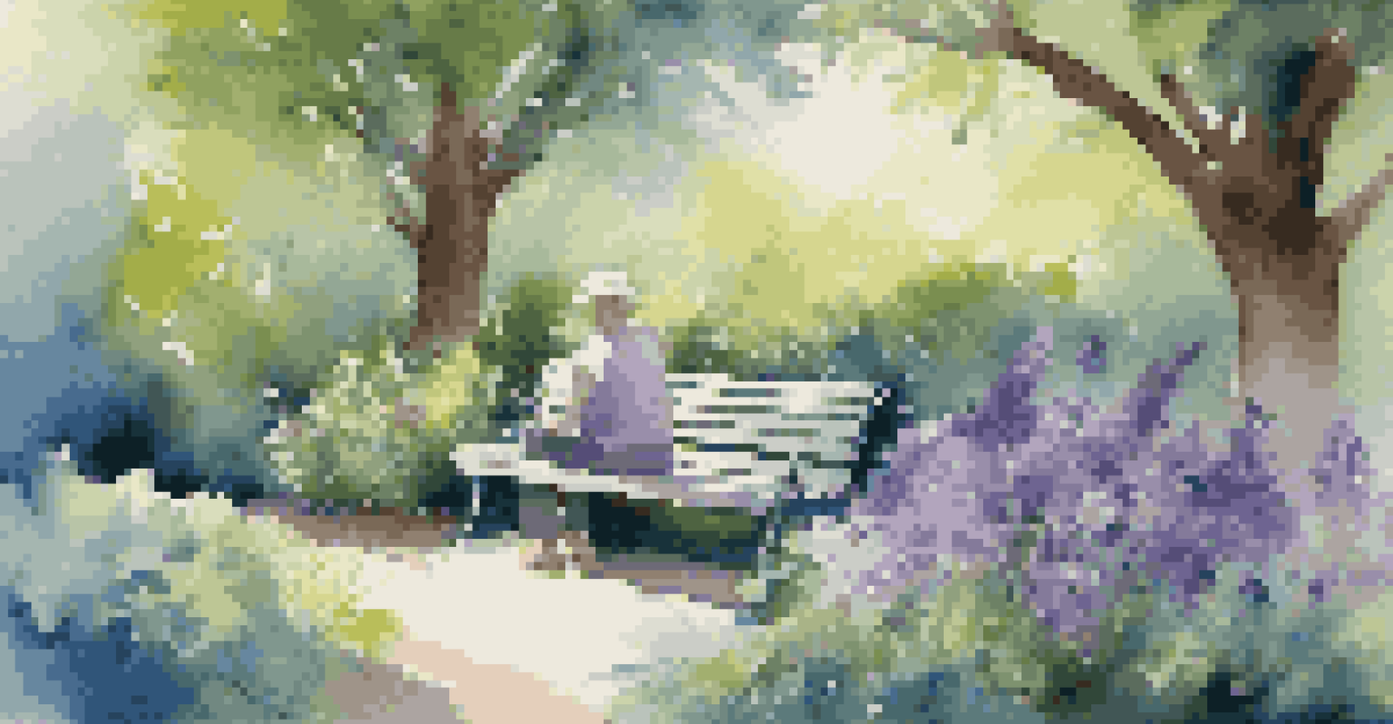
Cool colors like blue, green, and purple are typically associated with tranquility and peace. In art therapy, these colors can help clients achieve a sense of calmness and relaxation. When clients choose to work with cool colors, they may be seeking to soothe anxiety or stress, allowing them to explore deeper emotional issues safely.
Colors, like features, follow the changes of the emotions.
For instance, a client using blue may be expressing feelings of sadness or introspection, while green might indicate a desire for healing and balance. This understanding enables therapists to facilitate conversations around these emotions, promoting healing through creative expression.
Additionally, cool colors can create an inviting atmosphere during art therapy sessions. This calming environment encourages clients to open up, fostering a space where they feel safe to explore their emotions and experiences.
Using Color to Facilitate Emotional Expression
Art therapy often encourages clients to express themselves through various mediums, and color plays a key role in this process. By selecting specific colors, clients can convey emotions that they may struggle to articulate verbally. This non-verbal form of expression can be incredibly liberating and therapeutic.
For example, a client who feels overwhelmed might choose darker colors to represent their feelings of despair. By exploring the reasons behind their color choices, therapists can help clients unpack complex emotions and experiences. This process often leads to breakthroughs and healing.
Warm vs. Cool Colors in Expression
Warm colors can evoke energy and excitement, while cool colors promote calmness and introspection during art therapy.
Furthermore, the act of mixing colors and experimenting with different shades can serve as a metaphor for emotional complexity. Clients learn that just as colors blend and change, so too can their feelings evolve over time, fostering a sense of hope and resilience.
The Role of Color in Personal Reflection
Engaging with color in art therapy offers clients a unique opportunity for self-reflection. As they create, they can reflect on their emotions and experiences through the colors they choose. This reflective process can reveal patterns that may not have been evident before, leading to greater self-awareness.
For instance, if a client consistently gravitates toward dark colors, it might indicate underlying feelings of sadness or frustration. Discussing these choices with a therapist can help clients gain insight into their emotional states and drive personal growth. This understanding can be transformative.
Moreover, personal reflection through color can encourage clients to set intentions for their emotional journeys. By consciously choosing colors that inspire desired feelings, clients can cultivate a more positive mindset, enhancing their overall well-being.
Creating a Color Palette for Healing
In art therapy, creating a personalized color palette can be a powerful tool for healing. Clients are encouraged to select colors that resonate with their emotions and healing goals. This purposely curated palette becomes a visual representation of their journey, providing focus and clarity.
For example, a client may choose calming blues and greens to represent their desire for peace while incorporating vibrant yellows to symbolize hope. This intentional selection fosters a deeper connection to their emotions, allowing for more meaningful artistic expression.
Color Palettes Enhance Healing
Creating personalized color palettes allows clients to visualize their emotional journeys and focus on healing.
Furthermore, clients can use their palettes as a guide during sessions, helping them remain focused on their emotional objectives. This practice not only enhances the therapeutic experience but also empowers clients to take an active role in their healing journey.
The Therapeutic Value of Color in Group Settings
Art therapy isn't just an individual experience; it can also be incredibly beneficial in group settings. When participants use color in their artwork, it fosters a sense of community and shared experience. Group members can support one another in understanding the emotions behind their color choices, creating connections that promote healing.
For example, a group might discuss how different colors make them feel, sharing stories and insights that enrich their understanding of one another. This exchange can help participants feel less isolated in their struggles, highlighting the shared human experience of emotion.
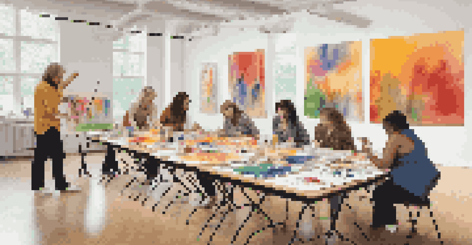
Additionally, the collective use of color in a group can lead to collaborative art projects, further enhancing the bond among participants. This teamwork fosters a sense of belonging, which can be profoundly healing for individuals navigating their emotional journeys.