The Role of Primary Colors in Artistic Expression and Design
Understanding Primary Colors and Their Significance
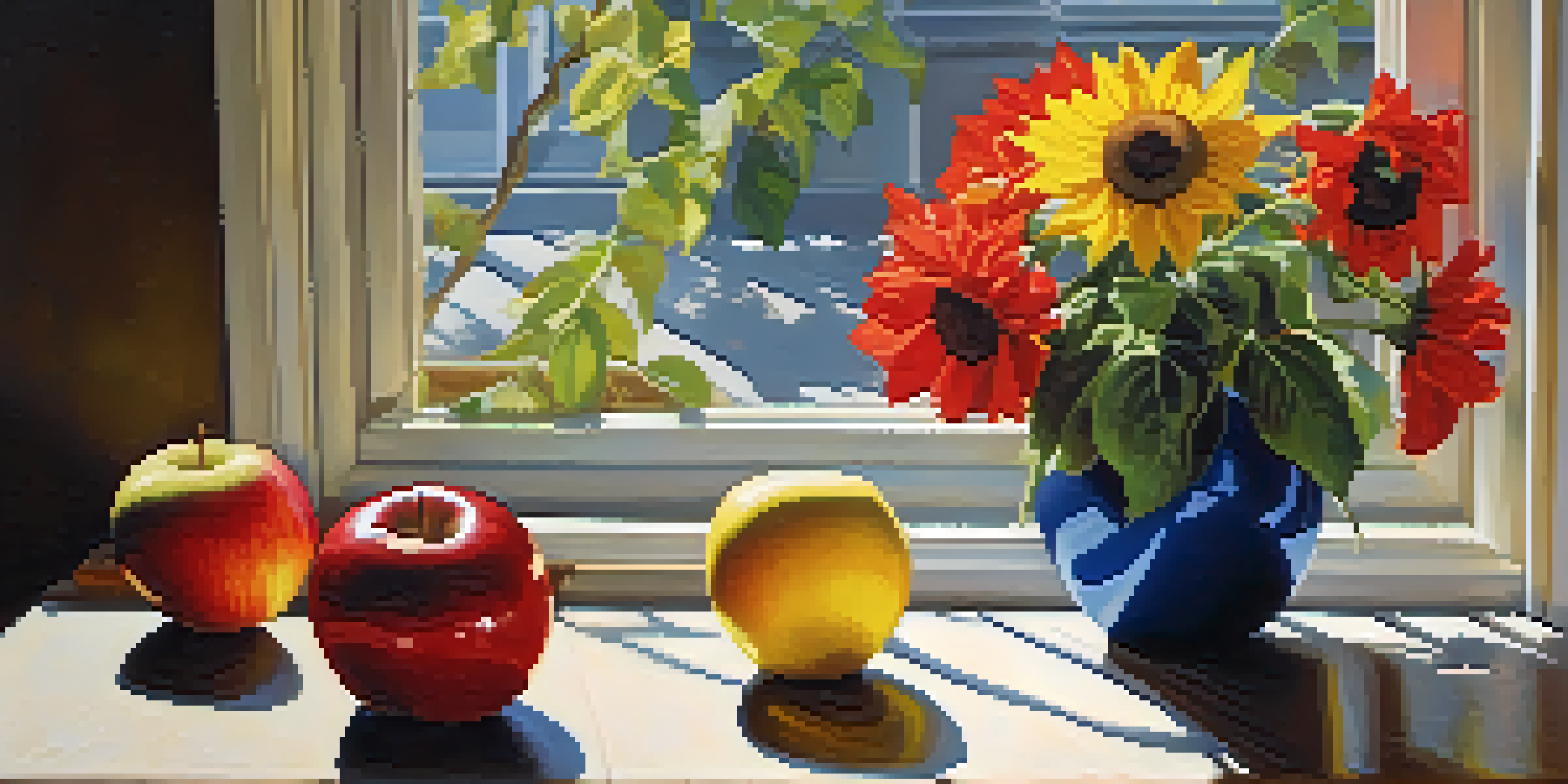
Primary colors—red, blue, and yellow—are the foundation of all other colors. They are unique in that they cannot be created by mixing other colors together, which gives them a special place in art and design. Each primary color evokes different emotions and reactions, making them powerful tools for artists and designers alike.
Color is the keyboard, the eyes are the harmonies, the soul is the piano with many strings.
For instance, red often symbolizes passion and energy, while blue can evoke calm and tranquility. Yellow, with its bright and cheerful disposition, tends to represent happiness and optimism. Understanding these emotional responses is crucial for artists seeking to convey specific feelings in their work.
By grasping the significance of primary colors, artists can make more informed choices about their palettes. This foundational knowledge also helps designers to create visually appealing compositions that resonate with viewers, establishing a strong emotional connection right from the first glance.
The Psychological Impact of Primary Colors
Colors have a profound psychological impact on our moods and perceptions. Studies have shown that different colors can influence feelings, behaviors, and even purchasing decisions. For example, restaurants often use red in their decor to stimulate appetite, while hospitals tend to favor blue for its calming effects.
Understanding how primary colors affect mood can aid artists and designers in their work. By intentionally selecting primary colors aligned with their intended message, they can enhance the overall impact of their creations. This can lead to deeper connections with the audience, as the emotions conveyed through color resonate on a subconscious level.
Primary Colors Evoke Emotions
Red, blue, and yellow each symbolize different feelings, making them essential tools for artists and designers.
Therefore, the psychological aspects of primary colors are essential for anyone involved in artistic expression or design. A thoughtful approach to color selection can elevate a piece from ordinary to extraordinary, making it more memorable and relatable to its audience.
Combining Primary Colors: The Basics of Color Theory
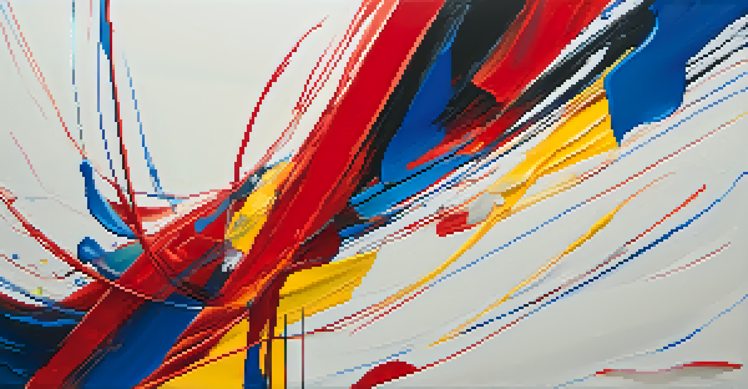
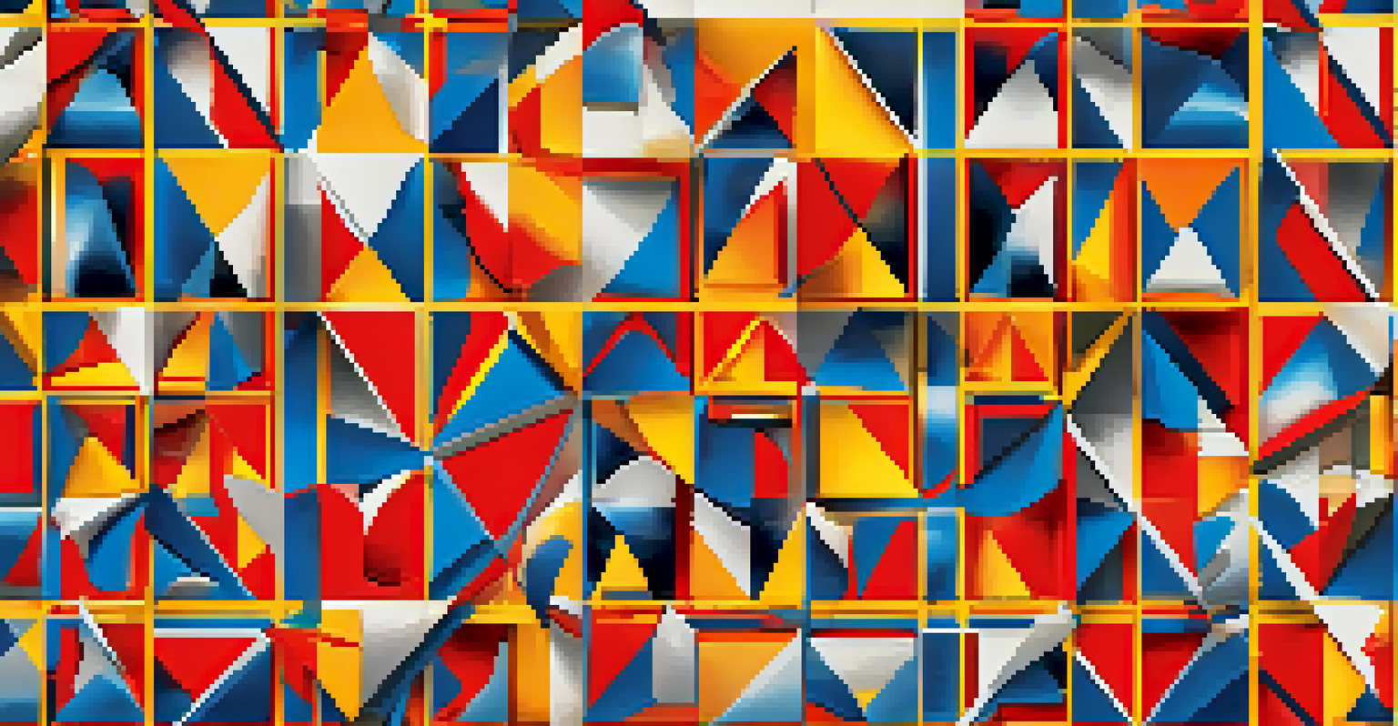
Color theory is a fundamental concept in art and design that explores how colors interact with one another. By mixing primary colors, we can create secondary colors—green, orange, and purple—expanding the color palette available to artists. This mixing process allows for an endless variety of shades and hues.
Colors are the smiles of nature.
Understanding the color wheel, which visually represents the relationships between colors, is essential for effective color use. Complementary colors—those opposite each other on the wheel—create high contrast and can make a design pop. Conversely, analogous colors—those next to each other—provide harmony and cohesiveness.
By mastering color theory, artists and designers can manipulate primary colors to achieve their desired effects. Whether they want to create a vibrant, energetic composition or a serene, harmonious space, a solid grasp of color mixing opens up a world of creative possibilities.
Cultural Interpretations of Primary Colors
Colors can carry different meanings across cultures, and primary colors are no exception. For instance, while red often signifies love or luck in many Western cultures, it can symbolize danger or mourning in others. This cultural variation adds depth to how primary colors are perceived in artistic expression.
Artists who are aware of these cultural interpretations can craft their work with a broader audience in mind. By considering how primary colors will be received in different cultural contexts, creators can not only enhance their message but also avoid potential miscommunications.
Cultural Context Influences Color Meaning
The significance of primary colors can vary greatly across cultures, impacting how art is perceived globally.
Ultimately, understanding the cultural significance of primary colors helps artists and designers create work that is both relevant and respectful. This awareness allows for a richer dialogue between the artwork and its viewers, fostering a deeper appreciation for the art across diverse backgrounds.
Primary Colors in Digital Design and Technology
In today's digital age, primary colors play a crucial role in web and graphic design. The RGB color model uses red, green, and blue as its primary colors, which are combined in various ways to produce a wide spectrum of colors on screens. Understanding this model is essential for designers working in digital mediums.
Color selection in digital design is not just about aesthetics; it also affects usability and accessibility. For example, high-contrast color combinations can improve readability, while colors that are too similar can make content difficult to engage with. Designers must consider both visual appeal and functional clarity when choosing their color palettes.
Moreover, primary colors are often used to establish brand identity in the digital landscape. Companies frequently leverage bold primary colors to create a memorable visual presence, ensuring their brand stands out in a crowded online marketplace. This strategic use of color can significantly impact a brand's recognition and perception.
The Role of Primary Colors in Fashion Design
Fashion design is another realm where primary colors hold significant sway. Many designers utilize these colors to create bold statements or evoke specific emotions through their collections. Bright primary colors can signal confidence and energy, making them popular choices for casual and athletic wear.
Seasonal trends in fashion often revolve around color palettes, with primary colors frequently making a comeback. For example, a collection featuring vibrant reds and yellows might embody the spirit of summer, while deeper blues and yellows can reflect autumnal themes. This cyclical nature of color trends keeps the fashion industry dynamic and exciting.
Color Theory Enhances Design Choices
Understanding color theory allows artists and designers to mix primary colors effectively, creating dynamic and harmonious compositions.
Ultimately, primary colors serve as a means of self-expression in fashion, allowing designers and consumers alike to convey their personality and mood. By embracing these fundamental colors, the fashion industry can continually innovate while staying rooted in timeless principles of design.
The Lasting Impact of Primary Colors in Art and Design
Primary colors have a lasting impact on art and design, influencing everything from famous masterpieces to contemporary creations. Many renowned artists, like Piet Mondrian and Wassily Kandinsky, used primary colors to explore abstraction and evoke emotion in their work. Their innovative approaches have paved the way for future generations of artists.
Even in modern design, the influence of primary colors remains strong. Whether it's in advertising, branding, or product design, these colors are often employed to grab attention and create a lasting impression. This enduring appeal speaks to the fundamental role that color plays in human experience.
As we continue to explore artistic expression and design, the significance of primary colors will undoubtedly remain relevant. They are not just aesthetic choices; they are powerful tools that can shape our perceptions, emotions, and reactions to the world around us.