The Science of Color: How It Affects Perception in Art

Understanding Color Theory and Its Basics
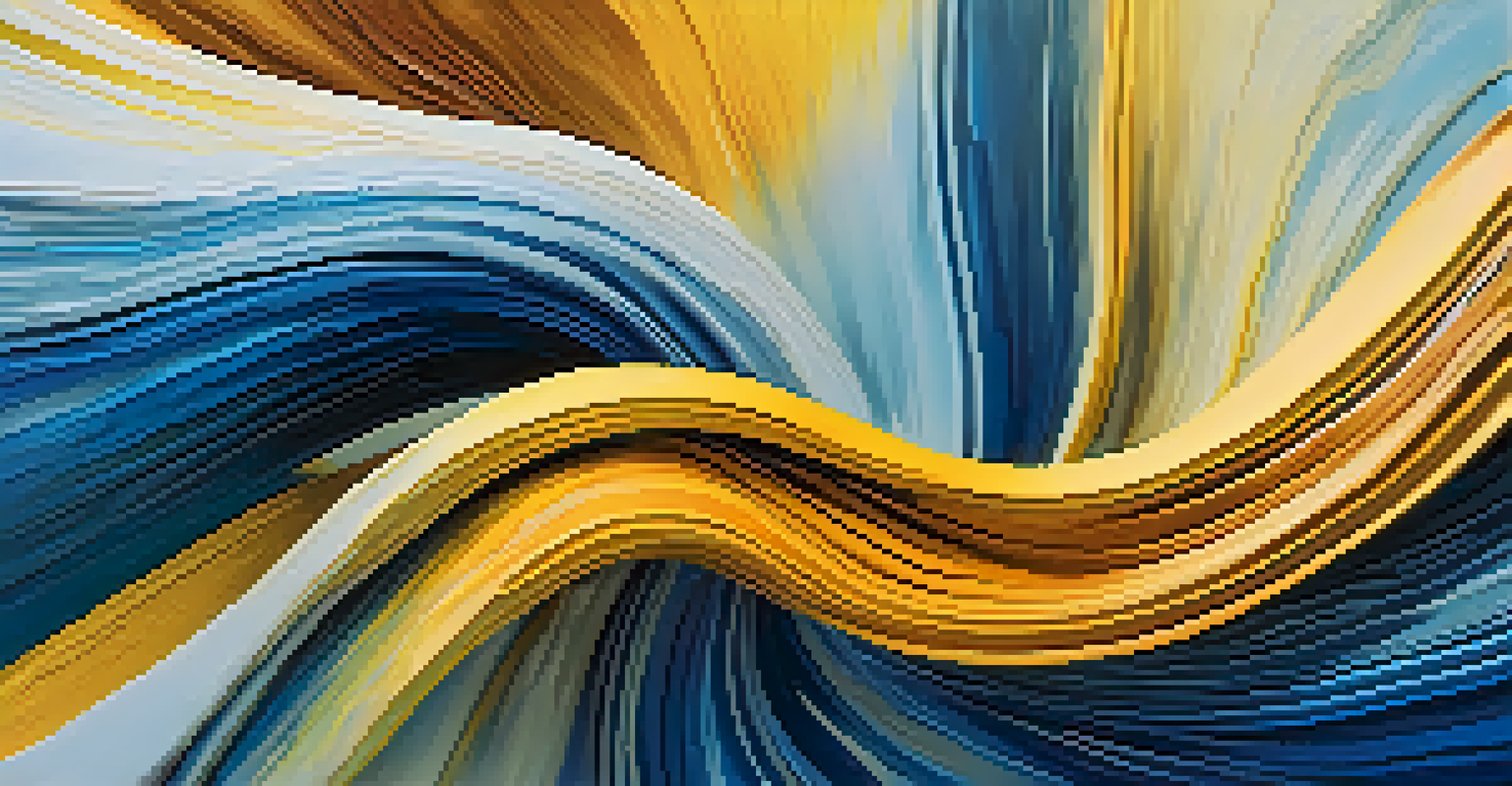
Color theory forms the foundation of how we perceive color in art. It encompasses the relationships between colors, including primary, secondary, and tertiary colors. By understanding these relationships, artists can create visually appealing compositions that evoke specific emotions.
Color is the keyboard, the eyes are the harmonies, the soul is the piano with many strings.
For instance, the color wheel is a vital tool that illustrates how colors can complement or contrast with one another. This concept is essential for artists looking to convey a certain mood or message through their work. When an artist chooses colors wisely, they can enhance their storytelling and engage the viewer more deeply.
Moreover, color theory isn't just about aesthetics; it also delves into the psychological effects colors have on us. Different colors can trigger different emotions, which is why artists are often intentional in their color choices to elicit specific responses from their audience.
The Psychology of Color in Art
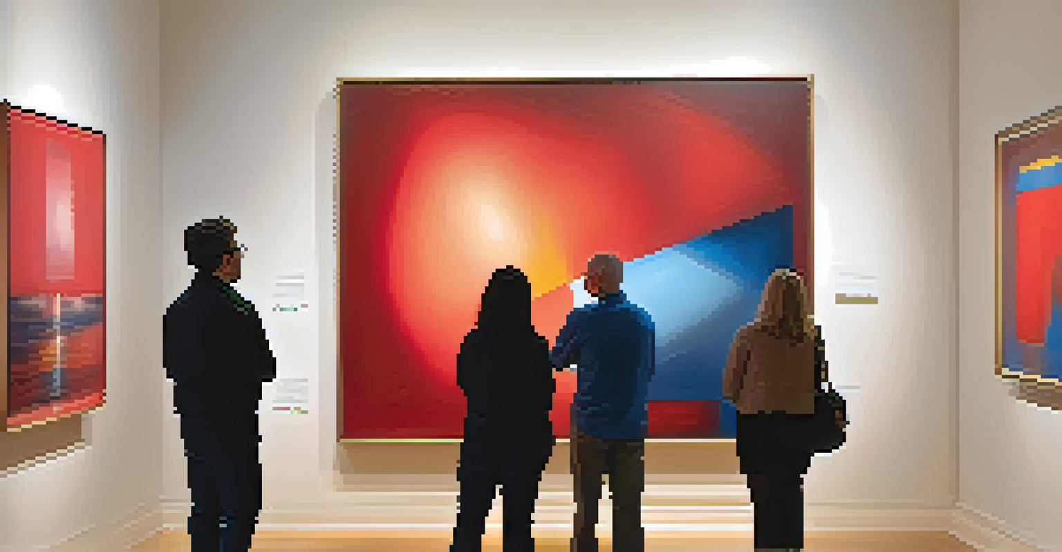
Colors can evoke powerful emotions and associations, influencing how we interpret a piece of art. For instance, warm colors like red and yellow often convey energy and passion, while cool colors like blue and green can evoke calmness and serenity. This emotional response is a key component of art appreciation.
Artists often use this psychological aspect of color to their advantage. For example, a painting dominated by reds may evoke feelings of warmth and excitement, while one with blues might convey tranquility. This interplay between color and emotion is integral to how we perceive and connect with art.
Color Theory Enhances Art Perception
Understanding color theory helps artists create compositions that evoke emotions and engage viewers effectively.
Understanding the psychology of color allows both artists and viewers to appreciate the deeper meanings behind a work. It highlights the importance of color as not just a visual element but also a powerful communicator of emotional context.
Color's Role in Cultural and Symbolic Meanings
Colors often carry cultural significance that can profoundly affect how art is perceived. For instance, white is associated with purity in many Western cultures, while in some Eastern cultures, it represents mourning. This cultural context can shift the interpretation of an artwork dramatically based on the viewer's background.
Colors, like features, follow the changes of the emotions.
Artists frequently draw on these cultural meanings to add layers to their work. By using colors that resonate with specific cultural symbols, artists can create pieces that speak to particular audiences or convey universal themes. This cultural aspect adds depth and richness to the interpretation of art.
Additionally, understanding these cultural associations can enhance a viewer's experience. When we recognize the symbolic meanings behind colors, we can appreciate the artist's intention and the broader narrative being conveyed.
The Impact of Light and Environment on Color Perception
The way we perceive color can change dramatically depending on the lighting and environment surrounding a piece of art. Natural light can bring out the vibrancy of colors, while artificial lighting may dull them. This variability plays a significant role in art galleries and exhibitions.
For example, an artwork displayed under warm, incandescent lights may present a different visual experience than the same piece viewed under cool, fluorescent lighting. Artists must consider these factors when creating their works and when planning exhibitions to ensure their colors are presented as intended.
Color's Cultural Significance Matters
Cultural associations with colors can dramatically influence how art is interpreted and appreciated by different audiences.
This dynamic relationship between light and color not only affects the visual appearance of art but also influences our emotional response to it. A well-lit piece can evoke feelings of joy and vibrancy, while dim lighting might create a more somber mood.
The Influence of Color in Modern Art Movements
Modern art movements have showcased innovative approaches to color usage, often challenging traditional perceptions. Movements like Fauvism embraced bold, unnatural colors to express emotion rather than realistic representation. This shift opened up new possibilities for artists to explore the power of color.
For instance, artists like Henri Matisse used vivid colors to convey feelings and provoke thought, rather than merely to depict reality. This emphasis on emotional expression through color has influenced countless artists and movements since, fostering a deeper appreciation for color in the art world.
Moreover, the exploration of color in modern art encourages viewers to engage with pieces on a more emotional level. It invites us to question our perceptions and consider the artist's intent, making the experience of viewing art more interactive and personal.
The Science Behind Color Mixing and Perception
Color mixing is a fascinating science that reveals how our eyes and brains perceive colors. There are two primary types of color mixing: additive and subtractive. Additive mixing occurs with light, like on a computer screen, where combining red, green, and blue light creates white. In contrast, subtractive mixing involves pigments, where combining colors like cyan, magenta, and yellow results in darker hues.
Understanding how colors mix can aid artists in achieving the desired effects in their work. For instance, knowing how to mix paints effectively can allow artists to create specific shades and tones that enhance their compositions. This knowledge can also help them avoid muddy colors that might detract from their artistic vision.
Technology Transforms Color Usage
Advancements in digital art technology allow for innovative color experimentation, reshaping how artists create and viewers perceive art.
Additionally, the science of color perception informs us about how our eyes interpret different wavelengths of light. This understanding can guide artists in making informed decisions about their color choices, ensuring that their artistic intent is effectively communicated to the viewer.
The Future of Color in Digital Art and Technology
As technology continues to evolve, so does our understanding and use of color in art. Digital art platforms offer an expansive palette of colors, enabling artists to experiment with shades and combinations that were once difficult to achieve. This accessibility transforms how we create and perceive art in a digital landscape.
Moreover, advancements in technology allow for more precise color representation and manipulation. Artists can use software to play with color theories and simulate how different lighting conditions can affect their work. This level of experimentation opens up new possibilities for creativity and expression.
The future of color in art will likely continue to blend tradition with innovation. As artists embrace digital tools, they will not only redefine their artistic processes but also influence how viewers engage with and interpret color in the art world.