Color Theory in Minimalism: The Use of Limited Palette
Understanding Color Theory Basics in Design
Color theory is the study of how colors interact and the emotions they evoke. It serves as a foundational element in design, especially in minimalism, where less is often more. By grasping the basics of color theory, designers can make intentional choices that enhance their creations.
Color is the keyboard, the eyes are the harmonies, the soul is the piano with many strings.
At its core, color theory encompasses the color wheel, complementary colors, and the psychology of color. For instance, blue can evoke calmness, while red might stimulate energy. Understanding these associations helps designers choose a limited palette that communicates a specific mood or message.
In minimalism, where simplicity reigns, the right colors can dramatically affect the overall aesthetic. A well-chosen palette can draw attention to key elements, create harmony, or even provoke thought, making it a powerful tool in the minimalist toolkit.
The Essence of Minimalism in Color Choices
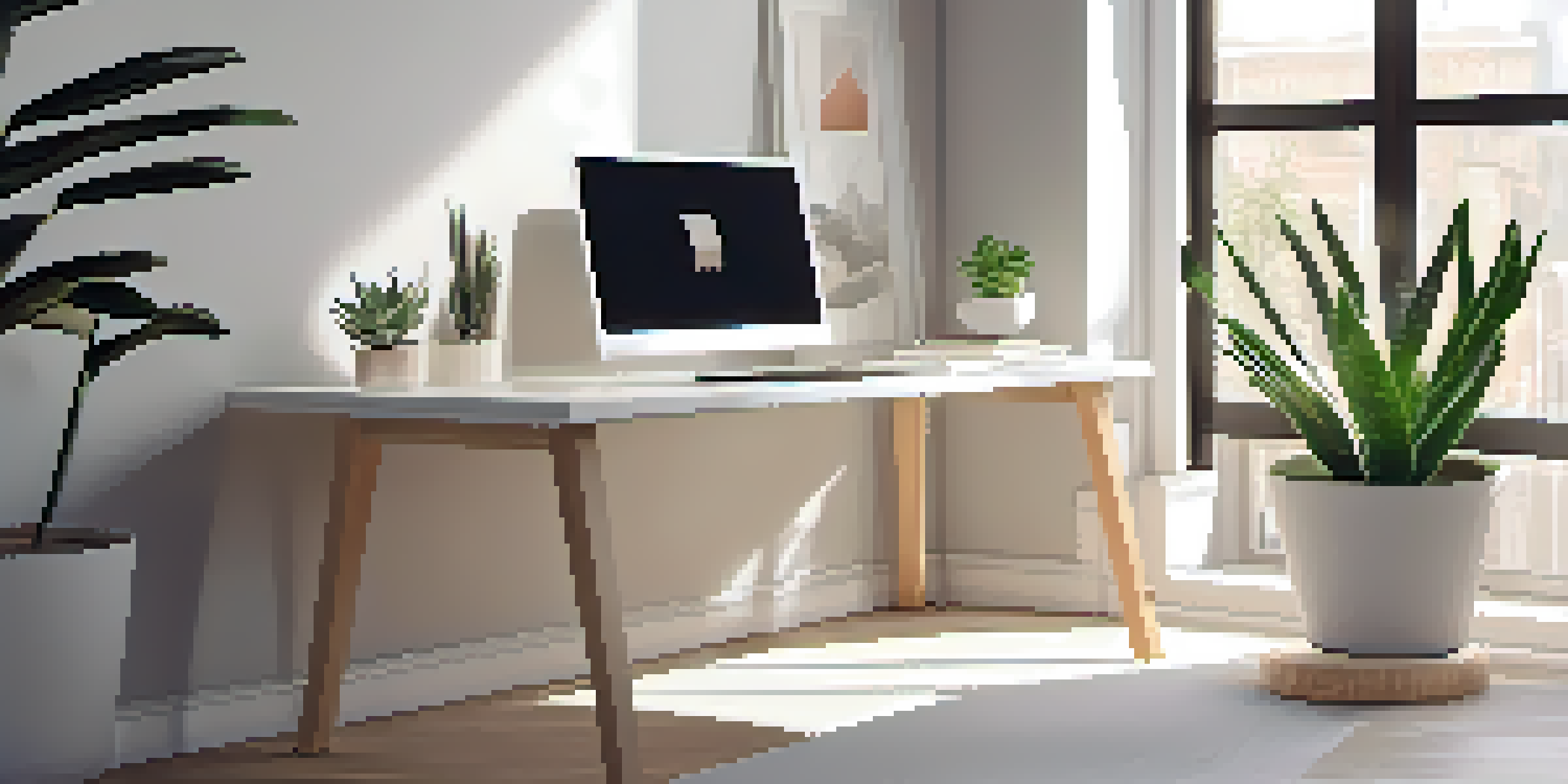
Minimalism is all about stripping away the unnecessary to focus on what truly matters. This philosophy extends to color choices, where using a limited palette can enhance clarity and impact. By reducing color options, designers can create a more cohesive and intentional visual experience.
When employing minimalism, every color selected carries significant weight. For example, a stark white background with a single vibrant hue can create striking contrast, drawing the viewer's eye to the focal point. This technique not only enhances aesthetic appeal but also communicates messages more powerfully.
Color Theory Enhances Design Choices
Understanding color theory helps designers select palettes that evoke specific emotions and enhance their minimalist designs.
Moreover, a limited palette in minimalism can promote a sense of tranquility and order. By avoiding the chaos of too many colors, the design feels more deliberate and thought-out, allowing the viewer to engage with it on a deeper level.
The Role of Contrast in Minimal Color Palettes
Contrast is a fundamental principle in design, and it plays a crucial role when working with a limited color palette. By juxtaposing light and dark shades, designers can create visual interest and hierarchy, even within a minimalist framework. This technique allows certain elements to stand out while maintaining an overall sense of balance.
Simplicity is the ultimate sophistication.
For instance, pairing a dark navy background with crisp white text not only enhances readability but also adds depth to the design. This contrast can guide the viewer's eye and emphasize key information, making it easier to absorb the intended message.
In minimalism, using contrast effectively can transform a simple design into something sophisticated and engaging. It's all about creating that delicate balance between simplicity and complexity, ensuring that every visual element serves a purpose.
Psychology of Color: Impact on Audience Perception
Colors evoke emotions and can significantly influence how an audience perceives a design. In minimalism, where each element is intentional, the psychological impact of color becomes even more vital. Choosing the right colors can enhance user experience and drive engagement.
For example, using soft pastels can create a calming atmosphere, while bold, saturated colors can energize and inspire. Understanding these emotional responses allows designers to craft experiences that resonate with their audience, effectively communicating messages without overwhelming them.
Minimalism Promotes Clarity in Design
A limited color palette in minimalism enhances visual clarity and creates impactful designs that focus on essential elements.
Additionally, minimalism allows these emotional cues to shine through. By focusing on a few key colors, the designer can articulate a strong narrative or feeling, leading to a more profound connection with the viewer.
Creating Harmony with a Limited Color Palette
Harmony in design refers to the pleasing arrangement of elements, and a limited color palette can facilitate this beautifully. By selecting colors that complement each other, designers can create a cohesive look that feels both polished and intentional. This harmony is especially crucial in minimalist design, where every detail counts.
Using a limited number of colors can help establish a visual rhythm throughout the design. For instance, if a brand uses a specific shade of green consistently, it can create a sense of unity across various touchpoints, reinforcing brand identity.
Moreover, harmony achieved through a limited palette can evoke a sense of peace and sophistication. The simplicity of the design allows viewers to appreciate the subtle nuances of color interactions, making the overall experience more enjoyable.
Case Studies: Successful Minimalist Designs
Examining successful minimalist designs can provide valuable insights into the effective use of color theory. Brands like Apple and Muji exemplify how a limited color palette can enhance brand identity and user experience. Their designs often rely on neutral backgrounds with strategic pops of color to draw attention.
For instance, Apple’s use of white space highlights its products, allowing the colors of the devices to take center stage. This approach not only simplifies the visual experience but also communicates a sense of sophistication and modernity.
Contrast Adds Depth to Minimalism
Using contrast effectively within a limited color palette transforms simple designs into engaging and sophisticated visuals.
Similarly, Muji’s understated aesthetic relies on earthy tones and simple designs, creating a calming shopping experience. These case studies illustrate how the thoughtful application of color theory in minimalism can lead to impactful design outcomes.
Tips for Implementing Limited Color Palettes
When embarking on a minimalist design project, implementing a limited color palette can be a game-changer. Start by selecting a primary color that reflects the mood or message you want to convey. Once you have your anchor color, consider adding one or two complementary shades to create depth without overwhelming the design.
Another tip is to use neutral tones to balance bold colors. Neutral backgrounds can help vibrant colors pop while maintaining an overall sense of calm. This strategy is particularly effective in minimalist design, where the aim is to create a clean and organized aesthetic.

Lastly, don't be afraid to experiment! Play with different combinations and shades to find what works best for your design goals. Remember that the beauty of minimalism lies in simplicity, so focus on clarity and purpose in your color choices.