The Role of Typography in Minimalist Graphic Design
Understanding Minimalist Graphic Design Principles
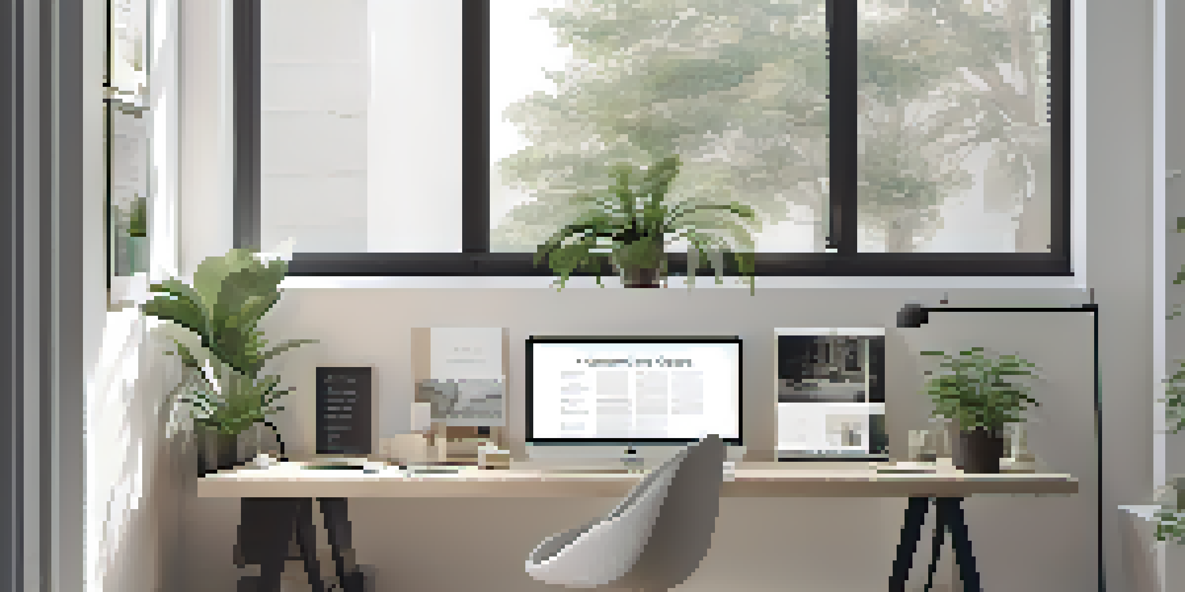
Minimalist graphic design is all about simplicity and functionality. It aims to convey messages using the least amount of elements, relying heavily on space, color, and typography. By stripping away unnecessary details, designers create a clean and impactful visual experience.
Simplicity is the ultimate sophistication.
The essence of minimalist design is to focus on what truly matters. This means every element, especially typography, must serve a purpose. Designers often use a limited color palette and simple shapes to enhance the overall aesthetic, making typography a critical part of the visual communication.
In this design approach, less is definitely more. When executed well, minimalist designs can evoke strong emotions and deliver messages effectively, allowing typography to shine as a key player in the storytelling process.
The Importance of Font Selection in Minimalism
Choosing the right font is crucial in minimalist design because it can set the tone for the entire project. A clean, sans-serif font often complements the simplicity of minimalist aesthetics, creating a modern look. On the other hand, decorative fonts can distract from the overall message and clutter the design.
When selecting a font, designers must consider readability and legibility. In a minimalist context, where space is limited, every letter counts. A well-chosen font not only enhances the visual appeal but also ensures that the message is communicated clearly and effectively.
Simplicity is Key in Design
Minimalist graphic design emphasizes simplicity, focusing on essential elements to create impactful visuals.
For example, using a bold typeface for headlines can draw attention without overwhelming the viewer. This careful consideration of typography helps to maintain a balance between aesthetics and functionality in minimalist designs.
Creating Hierarchy with Typography
Typography plays a vital role in establishing visual hierarchy in minimalist graphic design. By varying font sizes, weights, and styles, designers can guide the viewer's eye to the most important information. This hierarchy ensures that the design communicates its message effectively.
Good design is as little design as possible.
For instance, a larger font size for headings signals to the viewer that this is the main idea, while smaller text can offer supporting details. This strategic use of typography helps to create a seamless flow, allowing the audience to easily navigate through the content.
In minimalist designs, where every element is carefully curated, creating hierarchy through typography becomes even more essential. It allows designers to maintain clarity while emphasizing the core message amidst the simplicity.
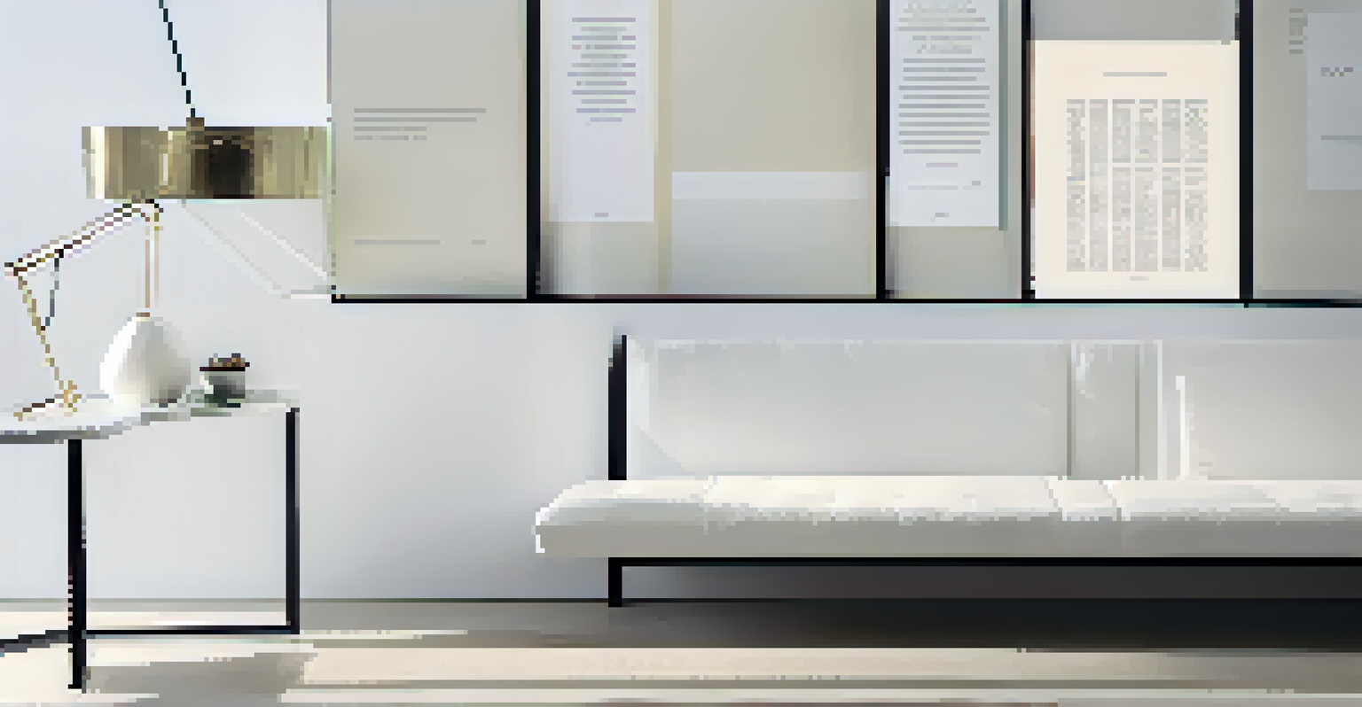
The Role of Spacing in Typography
Spacing is another critical aspect of typography in minimalist graphic design. Proper letter spacing, line height, and margins can enhance readability and create a polished look. In minimalist designs, where clutter is avoided, spacing ensures that each element has room to breathe.
For example, increased line spacing can make a block of text feel more approachable, inviting the reader to engage. Conversely, too little spacing can create a cramped appearance, making it difficult for viewers to absorb the information.
Typography Establishes Hierarchy
Effective typography is crucial in guiding viewers through content, ensuring clarity and emphasizing key messages.
By mastering the art of spacing, designers can elevate their minimalist designs, ensuring that typography not only serves its purpose but also enhances the overall aesthetic appeal.
Color and Typography: A Harmonious Relationship
In minimalist graphic design, color and typography work hand-in-hand to create impactful visuals. The choice of color can evoke emotions and set the mood, while typography communicates the message. Together, they form a cohesive design that resonates with the audience.
For instance, using a monochromatic color scheme can enhance the simplicity of a design while allowing typography to stand out. A bold color for headings against a neutral background can draw the viewer's attention, creating a focal point.
This harmonious relationship between color and typography is essential in minimalist design, as it reinforces the overall message while maintaining clarity and simplicity.
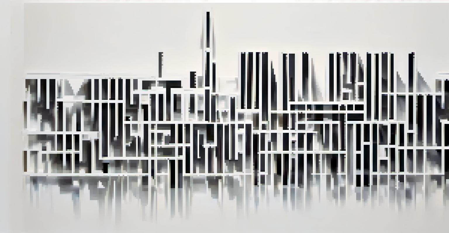
Embracing White Space with Typography
White space, or negative space, is a fundamental element in minimalist graphic design. It refers to the empty areas around text and images that give the design room to breathe. By effectively incorporating white space, typography can enhance readability and create a more engaging experience.
In minimalist designs, white space allows the typography to take center stage, emphasizing the message without distractions. It creates a sense of balance, making the design feel less cluttered and more intentional.
White Space Enhances Readability
Incorporating white space allows typography to breathe, improving readability and creating a more engaging design.
Ultimately, embracing white space in typography not only elevates the design but also fosters a deeper connection with the audience, encouraging them to focus on the content.
The Future of Typography in Minimalist Design
As design trends continue to evolve, the role of typography in minimalist graphic design will only grow in importance. With advancements in technology and digital media, designers have access to a wider range of typefaces and styles. This allows for more creativity while adhering to minimalist principles.
The challenge will be to maintain simplicity while exploring new typographic options. Designers will need to strike a balance between innovation and clarity, ensuring that their typography remains effective in conveying messages.
Looking ahead, the future of typography in minimalist design promises exciting possibilities. By continuing to prioritize simplicity and functionality, designers can create compelling visuals that resonate with audiences and stand the test of time.