Using Data Visualization to Teach Art Concepts

Understanding Data Visualization in Art Education
Data visualization is a powerful tool that simplifies complex information. In the realm of art education, it transforms abstract concepts into visual representations that are easier to grasp. By presenting data visually, educators can illustrate trends, patterns, and relationships within art history and theory, making it more relatable for students.
Data is the new oil.
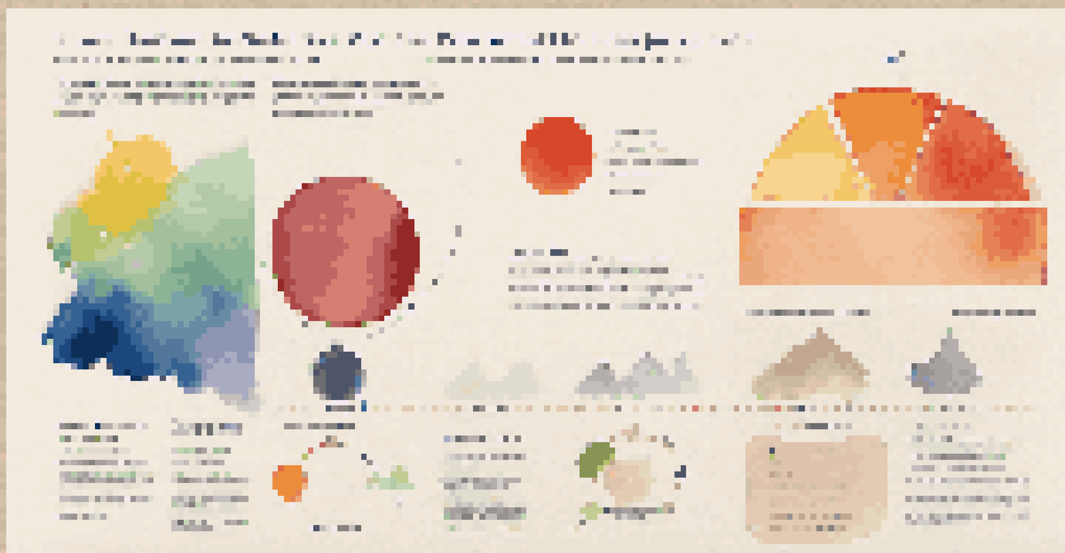
Imagine explaining color theory through a vibrant pie chart showing the color wheel. This visual aid not only captures attention but also helps students understand how colors interact. Such representations bridge the gap between analytical thinking and creative expression, making art concepts more engaging.
Ultimately, data visualization serves as a bridge connecting students with the material. It allows them to see the story behind the numbers, encouraging deeper understanding and sparking curiosity about various art topics.
Benefits of Visualizing Art Trends and Movements
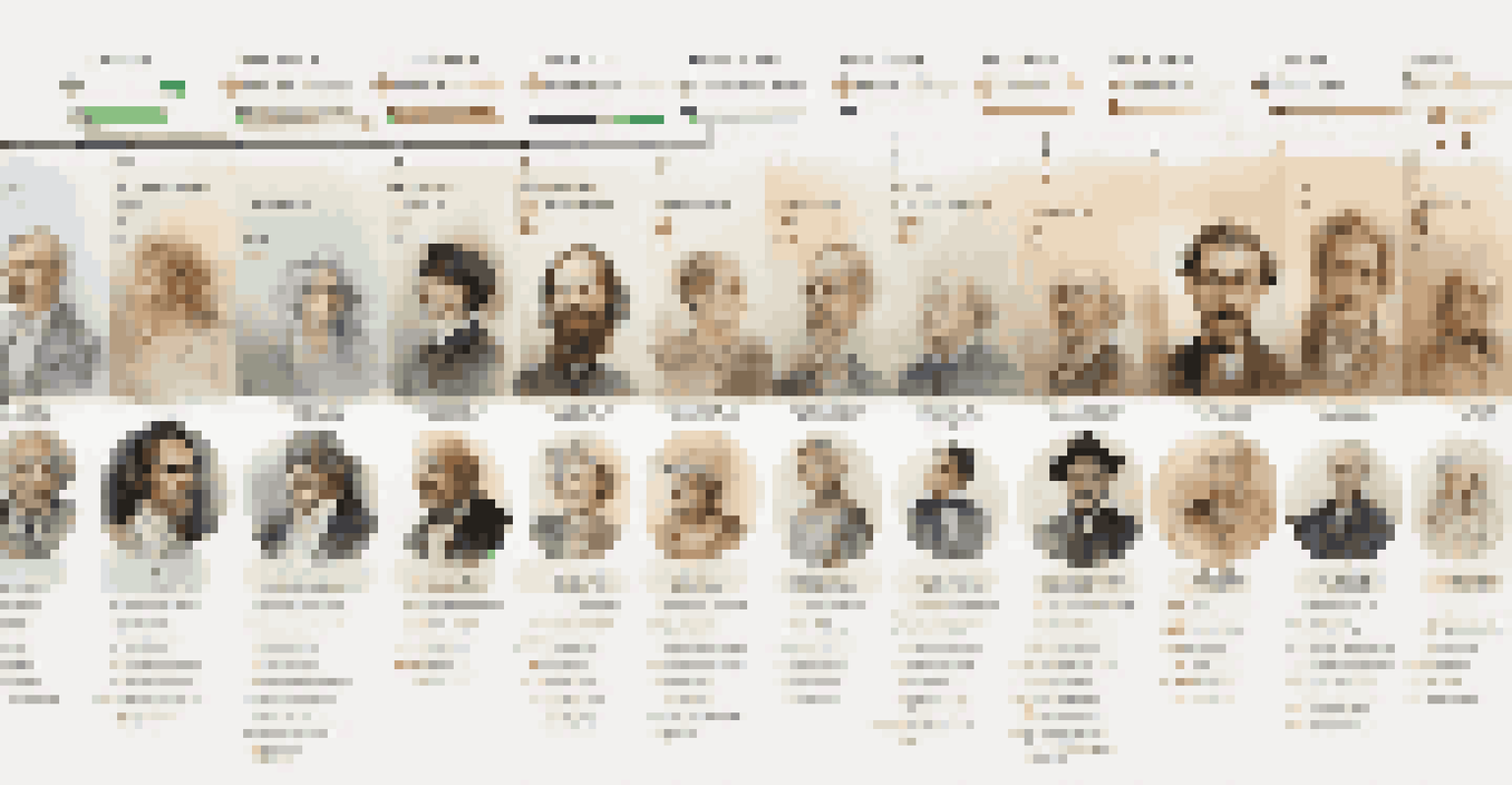
Visualizing art trends helps students grasp how movements evolve over time. For instance, a timeline chart can showcase the progression from Impressionism to Modernism, highlighting key artists and their contributions. This not only contextualizes the art but also encourages students to see how historical events influence artistic expression.
By examining visual data, students can identify patterns and correlations that might not be immediately apparent in text. For example, a graph illustrating the popularity of various art styles over decades can prompt discussions about cultural shifts and societal changes. This approach fosters critical thinking and analytical skills.
Data Visualization Enhances Learning
Using visual representations in art education simplifies complex concepts and engages students more effectively.
Moreover, seeing these trends visually can ignite a passion for art history. Students are more likely to engage with the content when they can visualize the connections between different styles and periods, transforming their understanding into a more dynamic experience.
Creating Interactive Data Visualizations for Engagement
Interactive data visualizations take learning to the next level by inviting students to explore concepts hands-on. Tools like infographics and interactive maps allow students to manipulate data, making the learning experience more engaging. This interactivity fosters a sense of ownership over their learning process.
A picture is worth a thousand words.
For example, an interactive chart showing the influences of different artists can allow students to click through and discover relationships themselves. This discovery process empowers them to take charge of their learning, leading to a deeper understanding of how art evolves.
Furthermore, interactive elements can cater to various learning styles. Whether through visual, auditory, or kinesthetic means, students can find a way to connect with the material that resonates most with them, ensuring a more personalized learning experience.
Using Infographics to Simplify Art Concepts
Infographics serve as a fantastic medium for summarizing complex art concepts in a visually appealing way. By distilling information into bite-sized pieces, infographics can highlight key points about a specific art movement or technique, making it easier for students to digest. This format is particularly useful for visual learners.
For instance, an infographic can break down the elements of design, such as line, shape, and color, using graphics and minimal text. This visual representation aids retention and recall, helping students remember critical concepts during discussions or projects.
Interactive Tools Foster Engagement
Interactive data visualizations allow students to explore and manipulate information, enhancing their learning experience.
Incorporating infographics into lessons not only enriches the content but also encourages creativity. Students can even create their own infographics as assignments, allowing them to engage with the material while developing their artistic skills.
Case Studies: Successful Integration of Data Visualization
Analyzing case studies where data visualization has been successfully integrated into art education can provide valuable insights. Schools that have adopted these methods often report increased student engagement and comprehension. For instance, a school might use visualization tools to teach art history, leading to enhanced participation in class discussions.
One notable example is a university that implemented a data-driven approach to explore the impact of social media on contemporary art. By visualizing the data collected from various platforms, students gained insights into how digital spaces influence artistic trends. This real-world connection makes the learning experience more relevant.
Such case studies can inspire other educators to adopt similar strategies. By showcasing the benefits and outcomes, they provide a roadmap for successfully integrating data visualization into art curricula.
Challenges and Solutions in Data Visualization for Art
While there are many benefits to using data visualization in art education, challenges do exist. One common hurdle is the initial learning curve for both educators and students. Not everyone is familiar with the tools necessary to create effective visualizations, leading to potential frustration.
To overcome this, educators can provide training sessions on available software and resources. Workshops or online tutorials can help everyone feel more comfortable with the technology, ensuring a smoother integration into the curriculum. Regular practice and collaboration can also build confidence in using these tools.
Future Trends: VR in Art Education
Emerging technologies like virtual and augmented reality promise to revolutionize how art concepts are taught and experienced.
Additionally, it's essential to choose the right type of visualization for the data being presented. Educators should aim for clarity and simplicity, avoiding overly complicated charts that may confuse students. By focusing on effective design principles, they can enhance the learning experience.
Future Trends in Data Visualization for Art Education
As technology continues to evolve, the future of data visualization in art education looks promising. Emerging tools and platforms are making it easier to create dynamic visual content that captivates students. Virtual reality (VR) and augmented reality (AR) are on the horizon, offering immersive experiences that could revolutionize how art concepts are taught.
Imagine students stepping into a virtual gallery where they can interact with artworks and see data about their history and significance. This kind of immersive learning could deepen their appreciation and understanding of art like never before. The integration of such technologies can also foster collaboration among students, as they share insights in real-time.
Ultimately, the future of data visualization in art education will likely focus on personalization and interactivity. As educators harness new tools, they can create tailored experiences that resonate with individual students, making art education more accessible and engaging for everyone.