Art and Data: Exploring the Aesthetic of Information

Understanding the Fusion of Art and Data
Art and data may seem like two distinct worlds, but they actually complement each other beautifully. At their core, both are about communication—art expresses emotions while data conveys information. When we merge these two realms, we open up new avenues for storytelling that are both visually captivating and intellectually stimulating.
Data is the new oil, but like oil, it must be refined to be valuable.
Consider how a simple graph can tell a complex story about climate change. By using colors and shapes creatively, data visualization transcends mere numbers, turning statistics into a narrative that resonates with viewers. This fusion encourages deeper understanding and engagement, making the data more accessible to a wider audience.
In many ways, the combination of art and data challenges our perceptions. It invites us to think critically about the information presented and inspires us to find beauty in the numbers around us. This exploration reveals that data isn't just cold facts; it can also evoke feelings, provoke questions, and spark curiosity.
The Role of Data Visualization in Art
Data visualization is an art form in its own right, transforming raw data into visual formats that are easier to digest. Think of infographics or interactive charts that not only present information but do so in a way that engages viewers. By employing design principles, these visualizations can highlight trends, patterns, and insights that might otherwise go unnoticed.

For example, a heat map can illustrate the spread of a disease or the popularity of a social media post across different regions. The colors and intensity create an immediate visual impact, making it easier to grasp complex information quickly. This immediacy can lead to informed decision-making based on the visual cues provided.
Art Transforms Data into Stories
By merging art and data, visualizations can convey complex narratives that resonate emotionally with viewers.
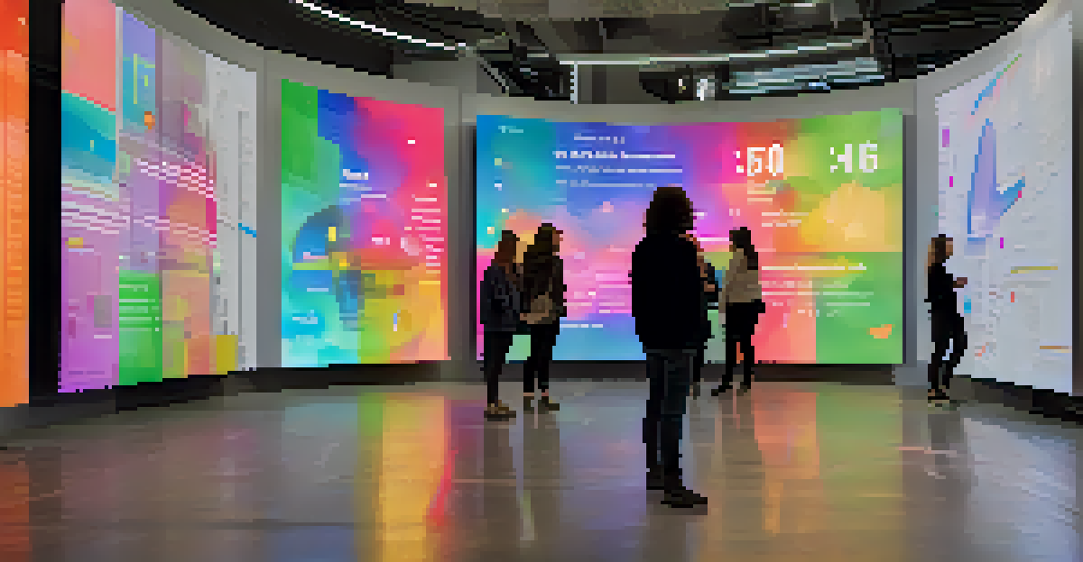
Moreover, artists who specialize in data visualization often experiment with various mediums, from digital platforms to physical installations. This creativity brings a fresh perspective to data, allowing it to be experienced in innovative ways. The result is a beautiful marriage of aesthetics and analytics that captivates and educates.
Artists Who Are Redefining Data Art
Many contemporary artists are pushing the boundaries of traditional art forms by incorporating data into their work. Take Rafael Lozano-Hemmer, for instance, whose installations often rely on real-time data to create interactive experiences. His work challenges viewers to engage with the information actively, turning passive observation into active participation.
Art is not a mirror to reflect reality, but a hammer with which to shape it.
Another notable artist, Fernanda Viégas, co-created the 'Wind Map', a stunning visualization of wind patterns across the U.S. This project not only informs but also mesmerizes, as viewers can see the invisible forces at play in a beautifully artistic way. Such examples demonstrate how artists are using data to create works that are not only visually striking but also rich in meaning.
These artists are not merely presenting data; they are creating dialogues around it. By blending aesthetics with analytics, they invite audiences to explore the implications of the data while enjoying the beauty of the visual presentation. This approach can shift how we perceive information and its impact on our lives.
The Importance of Aesthetic in Data Presentation
Aesthetic considerations in data presentation can significantly impact how information is received and processed. A well-designed visual can draw attention and elicit emotional responses, making the data more relatable. When aesthetics are prioritized, viewers are more likely to engage with the content, leading to a deeper understanding.
For instance, using contrasting colors and harmonious layouts can help to guide the viewer's eye, highlighting key insights and making complex data more approachable. In contrast, cluttered or poorly designed visuals can confuse and overwhelm, detracting from the message. Thus, the aesthetic quality of data presentations is not just about beauty; it's about effective communication.
Aesthetics Enhance Data Comprehension
Well-designed data presentations can make information more relatable and engaging, fostering deeper understanding.
Ultimately, the goal is to create a seamless experience where the viewer can appreciate both the art and the information. When aesthetics enhance understanding, data can transcend its numerical origins and become something that resonates on a personal level. This balance is crucial for fostering a stronger connection between the audience and the information being shared.
Case Studies: Successful Art and Data Collaborations
Many successful projects illustrate the powerful intersection of art and data. One notable example is 'Dear Data', a year-long project where two friends traded hand-drawn postcards visualizing their weekly data about personal habits. This project not only showcased the beauty of data but also created a personal and relatable narrative, making data more accessible to everyday life.
Similarly, the 'Data Poetry' project merges literature and data visualization, where poets use algorithms and data sets to create visual poetry. This innovative approach highlights how data can inspire creativity and evoke emotions, transforming numbers into something profoundly human. These projects exemplify the versatility and potential of combining art with data.
Such collaborations encourage new ways of thinking and spark conversations about the role of data in our lives. They demonstrate that data can be more than just numbers; it can tell stories, provoke thoughts, and inspire action. These case studies serve as a testament to the beauty that emerges when art and data come together.
Challenges in Creating Data-Driven Art
While the fusion of art and data is exciting, it does come with its challenges. One major hurdle is the potential for misinterpretation. If not designed carefully, data visualizations can mislead viewers, whether through distorted scales or unclear representations. Artists must ensure that their work communicates the intended message accurately.
Moreover, balancing artistic expression with data integrity is crucial. Artists may feel the urge to embellish or stylize data for aesthetic appeal, but this can compromise the accuracy of the information. Striking the right balance between creativity and factual representation is essential to maintain credibility.
Future of Art and Data is Bright
Advancements in technology will continue to drive innovative collaborations between artists and data specialists, creating compelling narratives.
Finally, accessibility is another challenge. Not all audiences have the same level of data literacy, and some may struggle to interpret complex visualizations. Artists and data scientists must consider how to make their work inclusive, ensuring that it resonates with a diverse audience while still conveying meaningful insights.
The Future of Art and Data Integration
The future of art and data integration looks promising, with advancements in technology paving the way for new creative possibilities. Emerging tools like AI and machine learning are enabling artists to explore vast datasets in innovative ways, creating dynamic visualizations that can evolve in real-time. This technology not only enhances creativity but also allows for deeper insights into the data.
As we continue to collect more data than ever before, the need for effective visualization will only grow. Artists and designers will play a vital role in translating complex information into compelling visuals that can inform and inspire. The demand for data-driven narratives will create opportunities for collaboration between artists and data specialists, leading to groundbreaking work.

Ultimately, the integration of art and data will foster a more informed society. By making data more engaging and accessible, we can harness its power to inspire change and drive innovation. As we look ahead, the possibilities for this beautiful intersection are limitless, promising a future where data is celebrated not just for its value but for its artistry.