How Color Affects Our Emotional Responses to Art

Understanding the Psychology of Color in Art
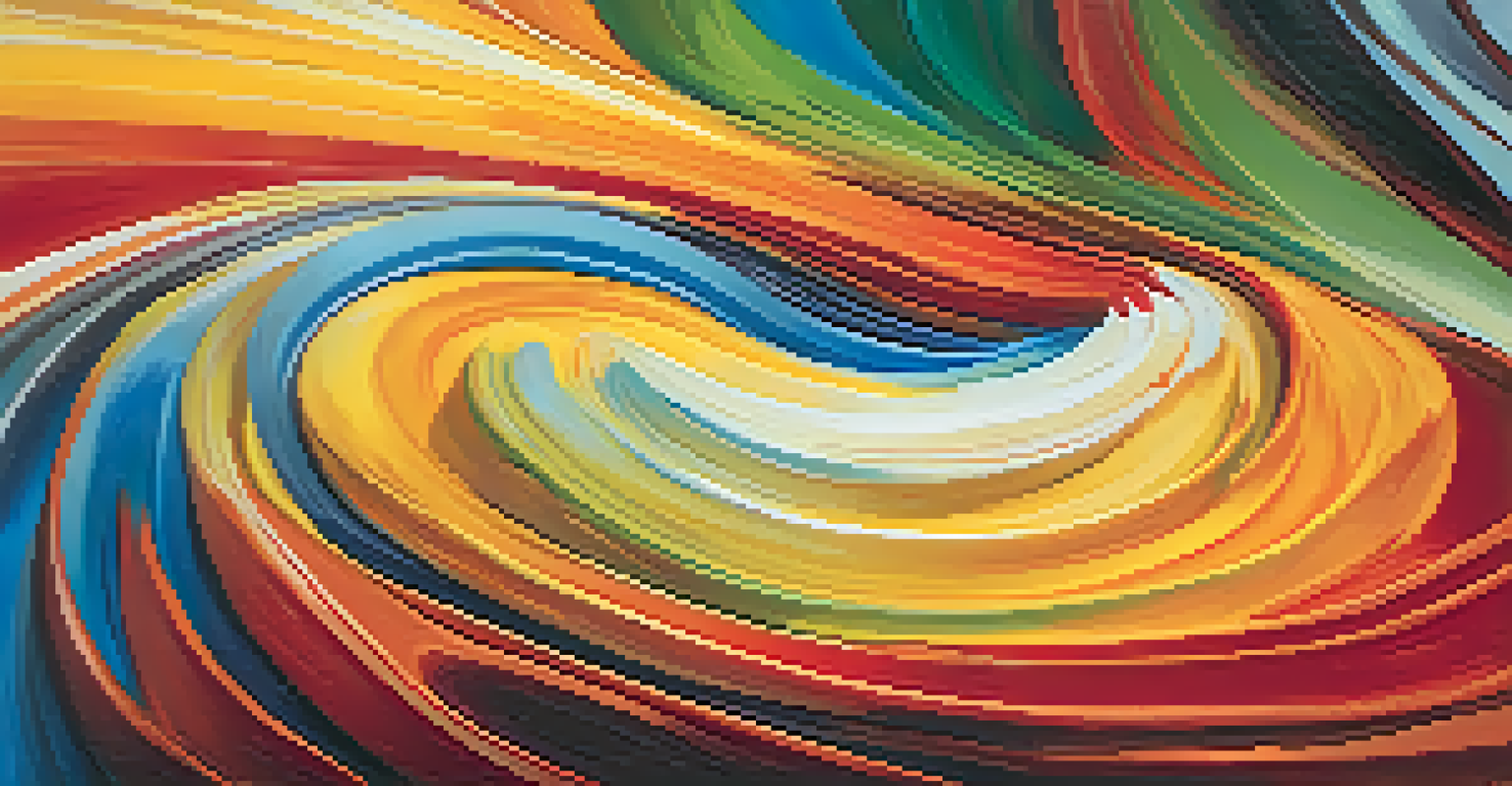
Color is not just a visual experience; it plays a profound role in how we perceive and feel about art. Each color carries its own psychological associations, which can evoke specific emotional responses. For instance, warm colors like red and orange often elicit feelings of warmth and passion, while cool colors like blue and green tend to promote calmness and tranquility.
Color is the keyboard, the eyes are the harmonies, the soul is the piano with many strings.
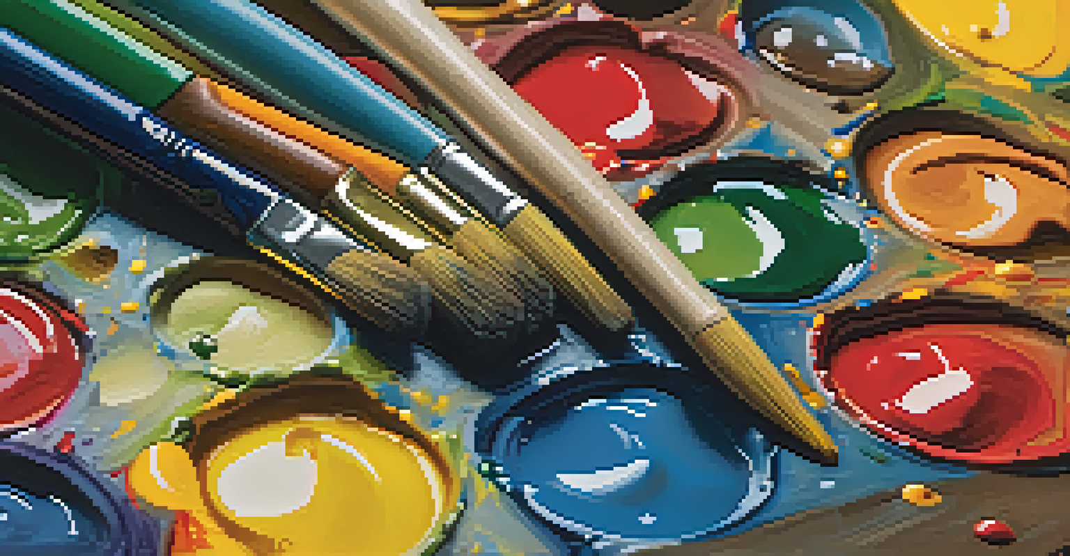
Artists have long understood this connection, using color strategically to influence the viewer's mood. Think about how a bright, sunny painting filled with yellows and oranges can uplift your spirits compared to a somber, gray piece. This interplay between color and emotion creates a powerful dialogue between the artwork and the observer.
Ultimately, the psychology of color in art is about more than aesthetics; it's about crafting a shared emotional experience. By recognizing how colors affect us, both artists and viewers can engage in a deeper appreciation of art and its emotional resonance.
The Warm Colors and Their Emotional Impact
Warm colors, including reds, oranges, and yellows, are known to create feelings of warmth and energy. These colors can stimulate emotions ranging from excitement and joy to anger and intensity. For example, a vibrant red can evoke passion or urgency, making it a popular choice in art that aims to draw immediate attention.
Artists often use warm colors to create a sense of movement and dynamism within their work. Imagine walking into a room with large red and orange canvases; you might feel an immediate rush of energy or excitement. This is why many advertisements and promotional materials use these colors to capture attention and convey a sense of urgency.
Color Evokes Emotional Responses
Different colors can trigger specific emotions, influencing how viewers perceive art.
However, it’s essential to note that context matters. A warm color in a calm setting can bring about comfort, while the same color in an aggressive composition might evoke tension. Understanding these nuances helps both artists and viewers navigate the emotional landscape of warm colors.
Cool Colors and Their Calming Effects
Cool colors such as blue, green, and purple are often associated with serenity and tranquility. These colors can help to soothe the mind and promote feelings of relaxation, making them a popular choice for artworks intended to evoke calmness. For instance, a painting featuring soft blues and greens might remind you of a peaceful ocean or lush forest, instantly bringing a sense of peace.
Colors are the smiles of nature.
Artists utilize cool colors to create depth and space in their compositions. A landscape painting with cool colors can transport viewers to serene locations, allowing them to escape the chaos of everyday life. This is one reason why many healthcare facilities use cool colors in their decor to promote healing and relaxation.
Interestingly, cool colors can also convey feelings of sadness or introspection, depending on how they’re used. A deep blue painting might evoke a sense of melancholy, while a lighter, more vibrant blue can inspire feelings of hope. Thus, cool colors offer a complex emotional palette for both artists and viewers.
The Role of Color Combinations in Art
The interplay of colors can create a unique emotional experience that transcends individual hues. When combined, colors can either enhance or counterbalance each other, leading to a wide spectrum of emotional responses. For example, pairing warm and cool colors can create visual tension that captures the viewer's attention and evokes complex feelings.
Consider a painting that features both warm oranges and cool blues; this combination can create a dynamic contrast that draws the eye and stimulates thought. Artists often experiment with color combinations to evoke specific moods or themes, using contrasting colors to emphasize a point or harmonious colors to create unity.
Cultural Context Shapes Color Meaning
Cultural backgrounds can alter the interpretation of colors, highlighting the importance of cultural awareness in art.
Ultimately, the relationships between colors can lead to powerful emotional narratives within a piece of art. Understanding these interactions allows both artists and viewers to appreciate the depth of emotions that color combinations can evoke.
Cultural Influences on Color Perception
Color perception is not only psychological but also deeply rooted in cultural contexts. Different cultures can assign various meanings to the same color, which can influence how art is interpreted across diverse audiences. For example, while white is often associated with purity in Western cultures, it can symbolize mourning in some Eastern cultures.
Artists must navigate these cultural associations when creating works intended for a global audience. A piece that features bold red may be seen as auspicious in some cultures while being perceived as aggressive in others. This complexity highlights the importance of cultural awareness in both the creation and appreciation of art.
Understanding these cultural influences can enhance emotional responses to art, allowing viewers to connect more deeply with the work. By acknowledging the diverse meanings behind colors, we can foster a richer dialogue about art and emotion.
Personal Experiences Shape Our Color Associations
Our personal experiences heavily influence how we respond emotionally to color in art. A color that brings joy to one person may evoke sadness in another, depending on their life experiences. For example, a bright yellow might remind someone of a happy childhood, while another person may associate it with a painful memory.
This subjectivity highlights the beauty of art—it's a deeply personal experience shaped by individual memories and feelings. Artists often draw from their experiences when choosing color palettes, hoping to resonate with viewers on a personal level. This connection can lead to profound emotional responses, making art a powerful medium for expression.
Personal Experiences Influence Perception
Individual experiences can shape emotional associations with colors, making art a deeply personal encounter.
By understanding how our personal histories shape our perceptions of color, we can appreciate the diverse reactions that art can evoke. It encourages us to explore our emotional landscapes and connect with art on a more meaningful level.
Conclusion: Embracing Color's Emotional Power in Art
In conclusion, color plays a pivotal role in how we experience and interpret art. From warm and cool tones to cultural meanings and personal associations, the emotional power of color is vast and varied. By recognizing these influences, both artists and viewers can engage with art in a more profound way.
The next time you encounter a piece of art, take a moment to reflect on how the colors make you feel. Do they evoke happiness, sadness, excitement, or peace? This reflection not only deepens your appreciation of the artwork but also enriches your understanding of your emotional responses.
Ultimately, embracing the emotional power of color can transform our art experiences, allowing us to connect with the artwork and each other on a deeper level. So, let’s celebrate the vibrant world of color and its ability to evoke a spectrum of emotions in our lives.