The Impact of Color on Taste Perception in Art

Understanding the Connection Between Color and Taste
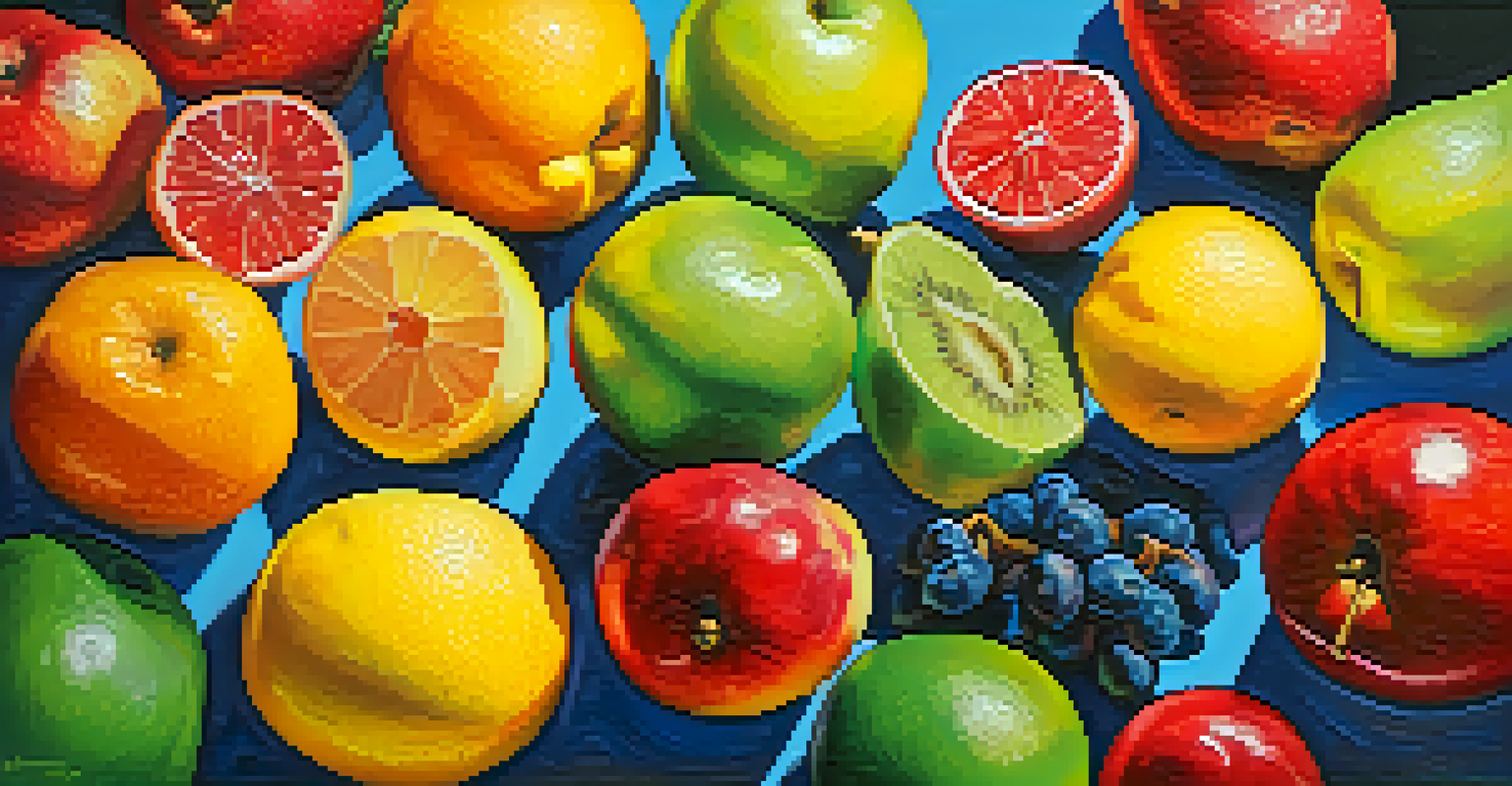
Color plays a significant role in how we experience taste. Our brains are wired to associate certain colors with specific flavors, which can enhance or alter our perception of a food's taste. For example, a bright red strawberry might evoke sweetness, while a dull brown one could suggest blandness.
Colors, like features, follow the changes of the emotions.
This connection isn't just limited to real food; it also extends to art. Artists often use color strategically to influence viewers' emotions and perceptions, including how they think a piece might taste. By understanding this interplay, we can appreciate how color choices in art can evoke sensory experiences beyond the visual.
Moreover, this phenomenon can be seen in various contexts, such as marketing and food presentation. When you see a colorful plate, your anticipation of flavor intensifies, demonstrating that our expectations can be shaped by visual cues.
The Psychology Behind Color and Flavor Associations
Psychology plays a crucial role in how we associate colors with flavors. Research has shown that certain colors can trigger specific emotional responses, which can, in turn, influence our taste perceptions. For instance, warmer colors like red and orange are often linked to excitement and warmth, while cooler colors like blue and green may evoke calmness and freshness.
In art, these psychological aspects of color can be harnessed to create a more immersive experience. An artist might use warm hues to make a dish appear more appetizing, while cooler tones can suggest a refreshing quality. This awareness allows artists to manipulate viewer perceptions in a way that enhances the sensory experience of their work.
Color Influences Taste Perception
Our brains associate colors with flavors, enhancing or altering how we perceive taste.
By understanding these associations, we can better appreciate the thought process behind artistic choices. The impact of color on our taste perception is not merely coincidental; it's a deliberate strategy employed by artists to engage our senses more fully.
Color Theory: A Tool for Artists and Chefs Alike
Color theory is a fundamental concept that both artists and chefs utilize to create appealing presentations. The color wheel, which includes primary, secondary, and tertiary colors, helps in selecting harmonious color combinations. When a dish is visually appealing, it can enhance the overall dining experience, making the flavors seem more vibrant.
Food is not just what we eat; it’s the experience of tasting, sharing, and enjoying it with others.
In art, color theory assists artists in choosing palettes that evoke certain moods or themes. For instance, a painting featuring a bright, sunny palette might suggest freshness and sweetness, while darker tones could imply richness or bitterness. This application of color theory not only enhances aesthetics but also deepens the viewer's engagement with the piece.
Ultimately, whether in a culinary dish or a piece of artwork, the application of color theory can significantly influence perception. It creates a sensory link that can guide expectations and emotional responses, illustrating the powerful relationship between color and taste.
Case Studies: Successful Use of Color in Art and Cuisine
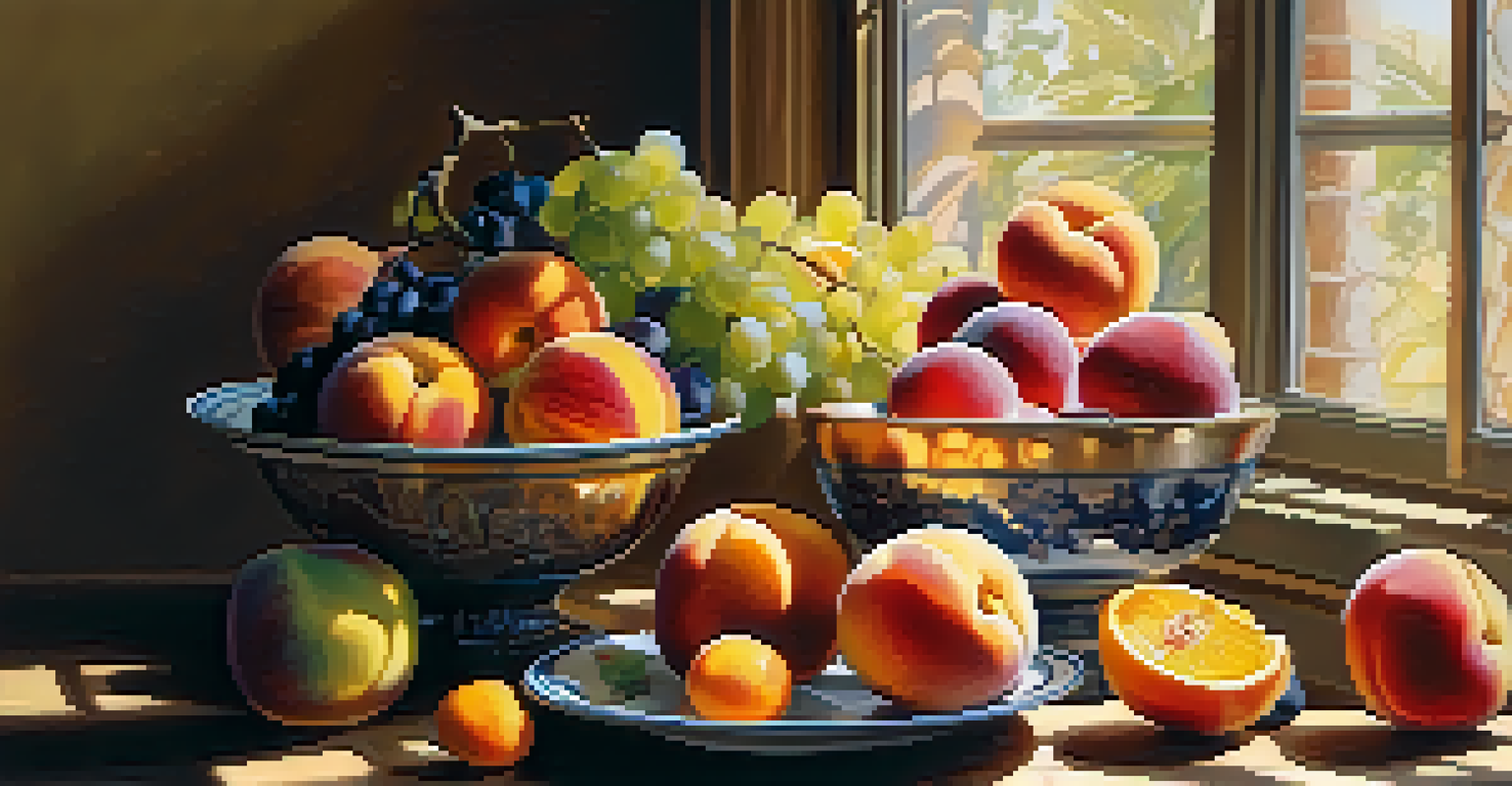
Many renowned chefs and artists have successfully harnessed the power of color to enhance taste perception. For example, the vibrant plating of dishes at high-end restaurants not only makes food visually appealing but also prepares the diner for a flavorful experience. Chefs often use bright garnishes or colorful sauces to evoke specific taste expectations.
In the art world, artists like Claude Monet used color to evoke sensations that resonate with taste. His depictions of fruit often overflow with vibrant colors, suggesting ripeness and flavor, inviting viewers to imagine the taste even without a single bite. This strategy highlights how visual art can create a multisensory experience.
Cultural Factors Shape Expectations
Cultural backgrounds significantly affect how we associate colors with flavors, influencing our taste experiences.
These case studies remind us that the interplay between color and taste is not just theoretical; it's actively employed in both culinary and artistic contexts. By examining successful examples, we see how effectively color can be used to enhance our perception of flavors.
Cultural Influences on Color and Taste Perception
Cultural background significantly influences how we perceive color and taste. Different cultures have varying associations with colors, which can shape our expectations of flavor. For instance, in some cultures, white is associated with purity and freshness, while in others, it might symbolize death and mourning.
In art and cuisine, these cultural nuances can lead to different interpretations of color's impact on taste. An artist or chef might intentionally select colors that resonate with their cultural heritage to evoke specific emotions or memories associated with food. This adds a rich layer of meaning to their work.
Understanding these cultural influences helps us appreciate the diversity in culinary arts and visual art. By exploring how different cultures perceive color and flavor, we can enhance our appreciation for both art and food from around the world.
The Role of Light in Color and Taste Perception
Light plays a crucial role in how we perceive color, and consequently, taste. The way light interacts with colors can alter our perception, making a dish appear more vibrant or dull. For example, sunlight can enhance the brightness of colors, making them seem more appealing and, by extension, suggesting a more intense flavor.
In art, lighting can dramatically change how colors are perceived, affecting the emotional response of the viewer. An artwork displayed under warm light might evoke feelings of warmth and comfort, while cooler lighting can create a sense of detachment or serenity. This interplay of light and color can influence our imagined taste of the subject matter.
Light Affects Color and Flavor
The interplay of light and color can dramatically change our perception of a dish's appeal and taste.
By understanding the impact of light, artists and chefs can enhance their work's appeal. Whether it's through the strategic placement of a dish under optimal lighting or choosing specific colors for a painting, the relationship between light, color, and taste perception is a vital aspect of creating a sensory experience.
Future Trends in Color and Taste Perception in Art
As we look to the future, the intersection of color and taste perception in art will likely evolve. Artists are increasingly experimenting with digital mediums and technology to create immersive experiences that engage all the senses, including taste. Virtual reality and augmented reality could allow viewers to explore colors and flavors in entirely new ways.
Moreover, as science continues to explore the psychology of color, artists and chefs may gain deeper insights into how to manipulate perceptions of taste through color choices. This knowledge could lead to innovative approaches in food presentation and artistic expression, creating even more engaging experiences.
Ultimately, the future of color and taste perception in art holds exciting possibilities. As we continue to explore this fascinating relationship, we can expect to see new trends that challenge our expectations and deepen our sensory experiences.