Techniques for Enhancing Your Art Through Color Theory
Understanding the Basics of Color Theory
Color theory is a foundational concept in art that helps artists understand how colors interact with each other. It involves the color wheel, which organizes colors into primary, secondary, and tertiary hues. By familiarizing yourself with this wheel, you can begin to see how colors complement or contrast, setting the stage for more dynamic artwork.
Color is the keyboard, the eyes are the harmonies, the soul is the piano with many strings.
At its core, color theory is about relationships. For example, complementary colors, which sit opposite each other on the wheel, create a high contrast and visual pop when used together. This can draw the viewer's eye and create focal points in your work, making your pieces more engaging and dynamic.
Additionally, the emotional impact of colors cannot be overlooked. Warm colors like reds and yellows evoke energy and warmth, while cool colors like blues and greens can impart calmness and serenity. Understanding these associations can help you convey the desired mood and message in your art.
The Role of Color Harmony in Artwork
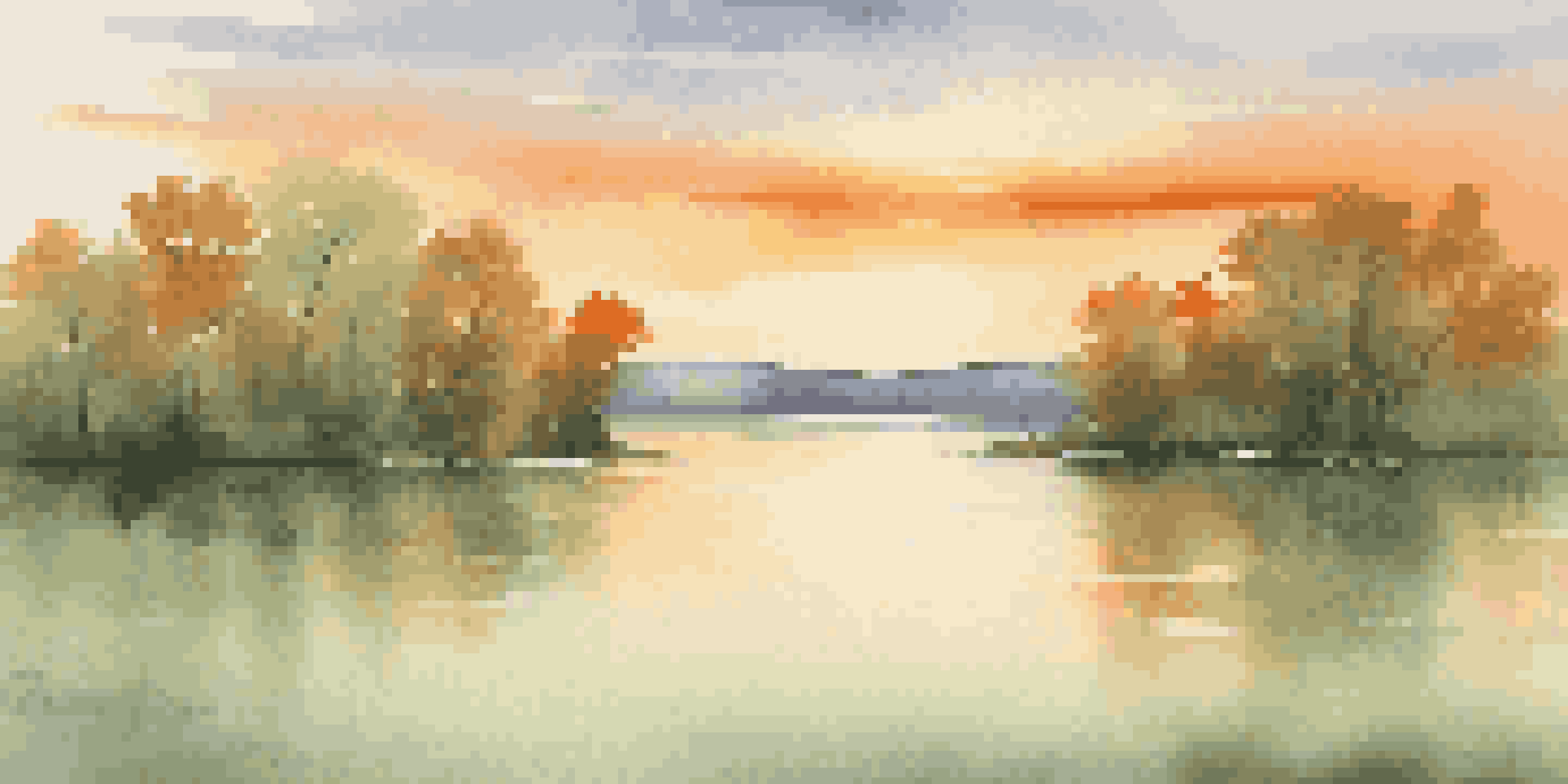
Color harmony refers to the pleasing arrangement of colors in a piece of art. It enhances the overall aesthetic and can make your artwork more appealing to the viewer. Techniques such as analogous color schemes—using colors that are next to each other on the color wheel—can create a sense of unity and cohesion.
For instance, a landscape painting featuring various shades of green, yellow, and blue can evoke a peaceful natural setting. By employing harmonious colors, you can guide the viewer’s experience and elicit specific emotions without overwhelming them.
Color Theory Basics Explained
Understanding the color wheel and relationships between colors helps artists create engaging and dynamic artwork.
Experimenting with different color harmonies can be a fun way to evolve your style. Don't hesitate to try out various combinations to see which resonate most with your artistic voice, and remember, what feels harmonious to you might differ from traditional norms, and that's perfectly okay!
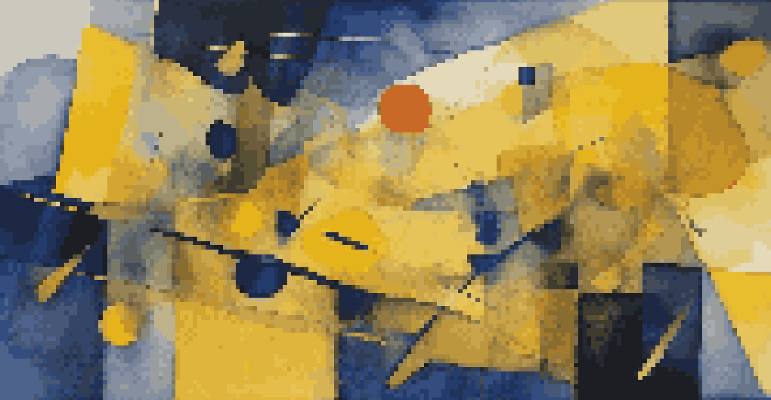
Using Color Contrast to Create Visual Interest
Contrast is a powerful tool in color theory that can add depth and excitement to your art. By using contrasting colors, you can highlight important elements and create dynamic compositions. For example, placing a bright yellow object against a deep blue background makes the yellow pop, drawing immediate attention.
Colors are the smiles of nature.
This technique can be particularly effective in storytelling through art. Consider how contrasting colors can represent opposing ideas or emotions, such as light versus dark or warmth versus cold. Using these contrasts thoughtfully can enhance the narrative quality of your artwork.
Moreover, experimenting with levels of brightness and saturation can also create contrast. A muted color palette can serve as a perfect backdrop for a single, vibrant element, allowing it to shine while maintaining an overall cohesive look.
The Impact of Color Temperature on Your Art
Color temperature refers to the warmth or coolness of a color, which can significantly affect the mood of your artwork. Warm colors, like reds and oranges, can evoke feelings of warmth and excitement, while cool colors, such as blues and greens, often create a sense of calm and tranquility. Understanding this can help you set the emotional tone of your piece.
For instance, a sunset scene painted with warm hues can convey a feeling of nostalgia or passion, while a seascape rendered in cool tones can express serenity. By consciously choosing colors based on their temperature, you can enhance the emotional resonance of your work.
Color Harmony Enhances Aesthetics
Utilizing harmonious color schemes can evoke specific emotions and create a cohesive visual experience.
Additionally, mixing warm and cool colors strategically can create a balanced composition. This contrast can guide the viewer's eye and create a dynamic interplay that keeps them engaged with your artwork.
Exploring Color Psychology in Art Creation
Color psychology is the study of how colors affect human emotion and behavior. As an artist, being aware of these effects can be instrumental in conveying your intended message. For instance, red is often associated with passion and energy, while blue may evoke trust and calmness.
By tapping into color psychology, you can deliberately choose colors that resonate with the feelings you want to evoke in your audience. If you want to inspire joy, consider using bright yellows and greens; if you’re aiming for a more somber tone, deeper blues and grays might be appropriate.
Experimenting with color psychology can lead to more impactful artwork. Consider how different viewers might interpret your color choices and how that aligns with your artistic intent. This awareness can enhance both the creation process and the viewer's experience.
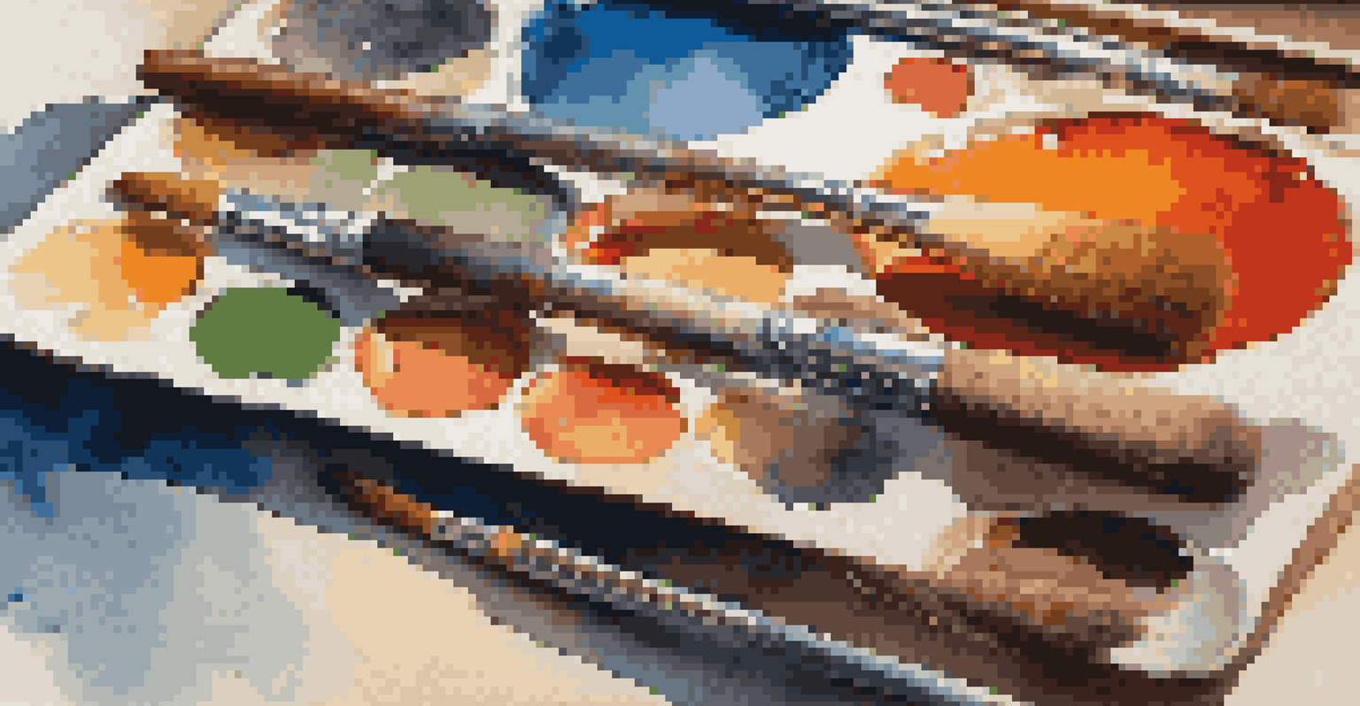
The Importance of Practice and Experimentation with Color
Practice is key in mastering color theory, just like any other artistic skill. The more you experiment with color mixing and application, the more intuitive your understanding will become. Don't shy away from creating color studies or small pieces dedicated solely to exploring different palettes and techniques.
Try challenging yourself with a limited palette for a week or two. This can help you learn how to make the most of the colors you have, mixing them in unexpected ways to create new shades and effects. Such practice can lead to unexpected breakthroughs in your artistic style.
Experimentation Fuels Artistic Growth
Practicing with color mixing and seeking feedback from others can lead to breakthroughs in your artistic style.
Moreover, engaging with other artists and seeking feedback can provide fresh perspectives on your use of color. Collaboration and discussion can spark new ideas and encourage you to step outside your comfort zone, ultimately enhancing your artistic journey.
Final Thoughts on Elevating Your Art with Color Theory
Incorporating color theory into your art can be a transformative experience. By understanding the principles of color harmony, contrast, temperature, and psychology, you can elevate your artwork to new heights. It’s not just about choosing pretty colors; it's about creating depth, emotion, and meaning.
Remember that art is a personal journey, and your relationship with color will evolve over time. Don't hesitate to trust your instincts and explore what feels right for you. Embrace mistakes as learning opportunities; they often lead to the most exciting discoveries.
Ultimately, the goal is to create art that resonates with both you and your audience. So take these techniques, experiment with them, and watch as your artistic expression flourishes through the powerful world of color theory.