The Symbolic Use of Color in Art: Meaning and Emotion

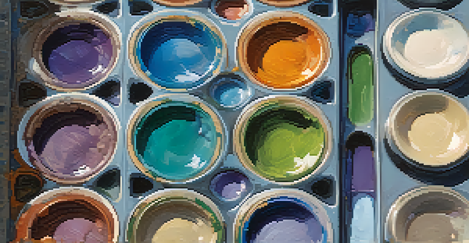
Understanding Color Theory: The Basics of Color Symbolism
Color theory serves as the foundation for understanding how artists use color to convey meaning. It explores the relationships between colors and their psychological effects on viewers. For instance, red often symbolizes passion or danger, while blue can evoke feelings of calmness and serenity.
Color is the keyboard, the eyes are the harmony, the soul is the piano with many strings.
In art, these color associations can vary based on cultural contexts and personal interpretations. An artist might choose a specific color not only for its aesthetic appeal but also for the emotional response it elicits. This interplay between color and emotion is what makes art so powerful and universally relatable.
Ultimately, understanding color theory deepens our appreciation of art. It allows us to connect more profoundly with the emotions and messages artists aim to convey through their color choices, enriching our overall experience of the artwork.
The Emotional Impact of Warm Colors in Art
Warm colors, like red, orange, and yellow, are often associated with energy and enthusiasm. Artists frequently use these colors to create a vibrant atmosphere and draw the viewer's attention. For example, Vincent van Gogh’s use of bright yellows in 'Sunflowers' radiates warmth and joy.
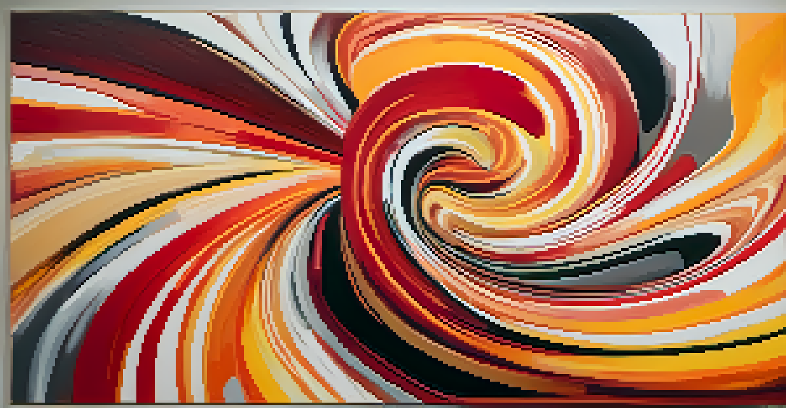
This emotional impact can also vary depending on context. While red can signify love, it might also represent anger in different scenarios. Understanding these nuances helps viewers appreciate the artist's intent and the emotions they wish to evoke.
Color's Emotional Influence in Art
Colors can evoke powerful emotions and responses, with warm colors promoting energy and excitement, while cool colors inspire calmness and introspection.
Incorporating warm colors into a piece can create a sense of urgency or excitement, making the artwork feel alive. This is why many artists deliberately choose warm palettes to enhance the emotional experience and engage their audience.
Cool Colors: Creating Calm and Reflection in Art
Cool colors, such as blue, green, and purple, often evoke feelings of tranquility and introspection. Artists utilize these colors to create serene landscapes or reflective portraits, inviting viewers to pause and contemplate. For example, Claude Monet’s water lilies showcase calming blues and greens that transport us to a peaceful state.
Colors, like features, follow the changes of the emotions.
The emotional resonance of cool colors can also symbolize sadness or melancholy, depending on how they are used. A stark blue sky might evoke a sense of loneliness, while a lush green forest can inspire feelings of hope and renewal. This duality allows artists to play with emotions creatively.
By using cool colors effectively, artists can establish a mood that resonates deeply with viewers, encouraging them to explore their own feelings and thoughts in relation to the artwork. This connection reinforces the power of color in shaping our emotional experiences.
Cultural Significance: How Color Meaning Varies Across Societies
Color symbolism is not universal; it can vary widely across different cultures. For instance, while white symbolizes purity and peace in Western cultures, it can represent mourning in some Eastern cultures. This cultural significance greatly influences how art is interpreted globally.
Artists who are aware of these cultural nuances may use specific colors to convey messages to particular audiences. By weaving cultural meaning into their work, they can create layers of understanding that enrich the viewer's experience. This is particularly evident in traditional art forms.
Cultural Variations in Color Meaning
The symbolism of colors varies significantly across cultures, influencing how art is interpreted and appreciated globally.
Understanding these cultural contexts allows us to appreciate the depth of meaning behind color choices in art. It reminds us that art is not only a personal expression but also a reflection of societal values and beliefs, making it even more impactful.
Color in Abstract Art: Emotion Beyond Representation
In abstract art, color often transcends representational forms, becoming a primary means of expression. Artists like Mark Rothko and Wassily Kandinsky used color to evoke emotions directly, rather than to depict objects or figures. Their works invite viewers to engage with emotions purely through color dynamics.
This non-representational approach allows for a personal interpretation of color, where each viewer may feel something unique based on their own experiences. It creates a powerful dialogue between the artwork and the observer, encouraging introspection and emotional exploration.
By focusing on color as the main element, abstract artists can communicate complex feelings that might be difficult to articulate with words. This profound connection emphasizes the importance of color in shaping our understanding of emotion in art.
Color Contrast: Enhancing Meaning and Emotion in Art
Color contrast refers to the difference between colors, which can create visual interest and highlight specific elements in a piece. An artist might use contrasting colors to draw attention to a focal point, creating a sense of drama or tension. For instance, the contrast between dark and light colors can evoke feelings of conflict or resolution.
This technique not only makes artwork visually striking but also enhances its emotional depth. By juxtaposing warm and cool colors, artists can convey a spectrum of emotions, from joy to sorrow. This dynamic interplay invites viewers to engage with the artwork on multiple levels.
Future Trends in Color Usage
Advancements in technology are transforming the use of color in art, allowing for innovative expressions and immersive experiences that challenge traditional perceptions.
Understanding how color contrast works enables us to appreciate the artist's strategic choices. It helps us see how contrasting colors are used not just for aesthetic purposes but also to create emotional narratives within the artwork.
The Future of Color in Art: Trends and Innovations
As technology advances, the use of color in art continues to evolve. Digital art platforms allow for an expansive range of colors and effects, pushing the boundaries of traditional color applications. Artists are now experimenting with virtual and augmented realities, creating immersive experiences that challenge our perceptions of color.
These innovations open up new avenues for emotional expression through color. Artists can manipulate color in ways that were previously impossible, allowing for more nuanced interpretations of emotion. This evolution reflects the ongoing dialogue between art and technology in contemporary society.
Looking ahead, the future of color in art promises to be exciting and transformative. As artists explore these new tools and mediums, we can anticipate fresh perspectives on how color shapes meaning and emotion, keeping the art world vibrant and ever-changing.